Think about your brand’s own website. We’re willing to bet there are a few things you—or your users—would like to change. But do those things really merit a full-blown website redesign?
When clients ask us to redesign their website, we ask them one very important question first: why? Website redesigns are a lot of work, and because it’s such a large commitment and investment, it’s important to understand when it’s time for a website redesign and when it isn’t.
Before you decide to bite the bullet and overhaul your current site, ask yourself these questions to ensure that you’re putting in the effort for the right reasons.
NOTE: just because one of these questions applies to you doesn’t mean that you 100% need a redesign. But if more than one applies…then we think it may be time to say good riddance to your current website.
1. Are my services or products changing?
If your products or services are drastically changing—or you’re adding entirely new ones—you might consider redesigning your website to support the new additions.
For example, let’s say you’re an e-commerce company that sells women’s clothing exclusively. After a few strong years, you decide to expand to include men’s clothing as well.
Now, unlike adding a smaller category, like women’s sunglasses, men’s clothing doesn’t fit within your current site structure. In this case, you’d probably need to redesign your website to support the new line of clothing, and even reconsider how it fits into your brand from a high-level perspective.
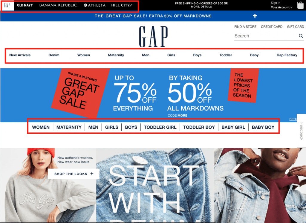
If you look at a complex brand like Gap, you’ll see how brand architecture can affect your online presence. Not only do they represent Gap and all the different categories that fall underneath (men, women, girls, boys, etc.), but they also showcase sister brands like Banana Republic and Athleta (Old Navy is apparently splitting from the group).
Brand architecture and product organization was an issue for our client, Airhead Sports Group. They had five separate websites that needed to be consolidated into one. As you can imagine, the architecture for the brand and the site needed to be reworked, so a redesign was absolutely necessary.
2. Has my audience shifted?
A shift in your target audience or personas can be the consequence of several things—a rebrand, brand consolidation, a merger or acquisition, a market shift, or a new product or service launch. Regardless of the cause, one thing’s certain: you might consider a website redesign.
From design and tone to overall site structure, your website should appeal to the people you’re selling to. And if your audience is changing, the last thing you want to do is keep your site stagnant.
Adjusting your site to appeal to a new audience—whether that’s adding things like user-generated content for a younger audience, or including helpful tools for baby boomers—can help improve things like brand loyalty, conversion rates, and customer retention.
3. Can everyone access my site?
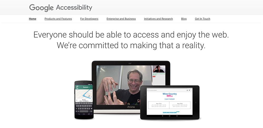
Over the years, we’ve seen Google become more particular with the way sites are built. From algorithm updates to mobile-responsive design, what the search engine giant says is pretty much what goes. And what’s hot right now? Accessibility for those with disabilities.
Not sure if your site meets the accessibility standards? Try using Google’s Lighthouse—a tool that runs a “gut check” on your site’s performance, including any issues with accessibility. It also recommends next steps to improve your site, shares potential errors and issues hurting your SEO, and, most importantly, shows you what you need to fix to make sure that everyone can use your site comfortably.
If you find that your site is currently failing, accessiBe is also a great tool you can quickly implement to make your site meet most accessibility standards. We use it, and we love it. (See that little purple guy in the bottom left corner of our site? You could have it too.)
Aside from the fact that you can get sued by not complying to accessibility standards, creating an inclusive website is really important—everyone deserves to be able to access the internet. And, with tools like Lighthouse and accessiBe, there isn’t really an excuse going forward.
4. Is my site secure?
Not only does Google care about a secure site, but with the number of internet hacks in recent history, you should too. If you aren’t hosting with a reliable partner, utilizing a secure sockets layer (SSL), or protecting your site with a web application firewall (WAF), your site might be vulnerable.
On top of keeping your stuff secure, browsers are actually training users to distrust sites that aren’t using SSL. The Verge reported that in July 2018, Chrome will label all “HTTP” sites as “not secure”…so whether or not you believe security matters, you’ll lose users if you don’t make the switch.
5. Does my current site help me reach my business goals?
What’s the purpose of your website? Whether it’s to drive conversions, generate revenue, or engage your audience, your website should support your larger business goals. Need your website to be a lead generating machine? Make sure you have the ability to test things like CTAs, forms, text, and images. Need it to inform your audience to gain their trust and loyalty? Make sure you have the ability to provide interactive tools and research for them to use.
At the end of the day, your website serves a specific purpose to your overall business strategy, and it should be designed and developed in a way that helps you get there.
6. Is my current site manageable (and scalable)?
This is the only question on our list that has little to do with your current website, business strategy, or brand, but rather the people working behind the scenes. If your website is so hard to manage on the backend that it’s sucking up everyone’s time, from developers to content loaders, it’s probably a sign that you need a website overhaul.
Think about it this way. For every hour it takes your developer to fix a bug or create a custom solution to a problem, it costs you money. Same goes with content loading and managing the website (if you’re even able to update content!). On the flip side, making updates to your website can happen more quickly with a good backend, leading to improved product launches or other business initiatives.
So, while paying for a new website might be scary today, the long-term cost savings can help alleviate some of that financial stress.
7. Can users find what they’re looking for?
There’s a reason users are visiting your site. And if you can’t give them the answers they’re looking for, they’ll leave, affecting not only their personal experience, but how your website ranks and shows up in the SERPs, too.
A great experience allows users to access content easily—and quickly—without having to dig around your site or try too hard. And while UX design impacts this directly, technical elements like page load time also improve the user’s experience.
Ultimately, failing to provide the right information to users and delivering a poor experience can result in dismal user engagement metrics, increased bounce rates, and poor organic performance. Make sure you’re thinking about user paths and designing a site that’s intuitive, fast, and easy to navigate.
8. Is it mobile responsive?
A mobile-responsive design focuses on delivering an optimal viewing experience for users on mobile devices, ranging from smartphones to tablets. This type of design responds and adjusts to the screen size of the device in use.
If your site isn’t responsive, it’s going to affect your mobile user experience. Plus, Google “recommended” that all sites become responsive in 2015, stating that non-responsive websites would perform worse in the SERPs compared to sites that are designed to please both desktop and mobile users alike. Our advice? Do what Google says and make your mobile users happy.
9. Does it truly reflect my brand (and where it’s going)?
Your website is an extension of who you are as a company, and should ultimately reflect your brand strategy. Whether your company has recently shifted its brand identity (including everything from its mission statement and values to its overall identity and logo) or even merged with or acquired another organization, you’ll need a new website to reflect that change.
From design choices to messaging and tone, a rebrand almost always calls for a website redesign.
A Major—But Worthwhile—Effort
Redesigning a website is no walk in the park. Not only is it a huge commitment, but it’s truly a team effort, whether that team is in-house or it’s one or many outside vendors and agencies. But, if you’re experiencing any of the above problems or changes, a website redesign just might be worth it.
At Element Three, we’ve helped clients completely overhaul their websites to truly capture their brand and reach their business goals. To see a few examples, head to our work page!


