Yes, it’s possible to be empathetic humans and a powerhouse challenger brand.
Royal United Mortgage’s external brand didn’t reflect what they were proud of: their uniquely human approach to helping underserved customers get the loans they need.
They consistently competed with well-known lenders but needed to say something unique to the market.
WHAT WE DID
Branding Discovery
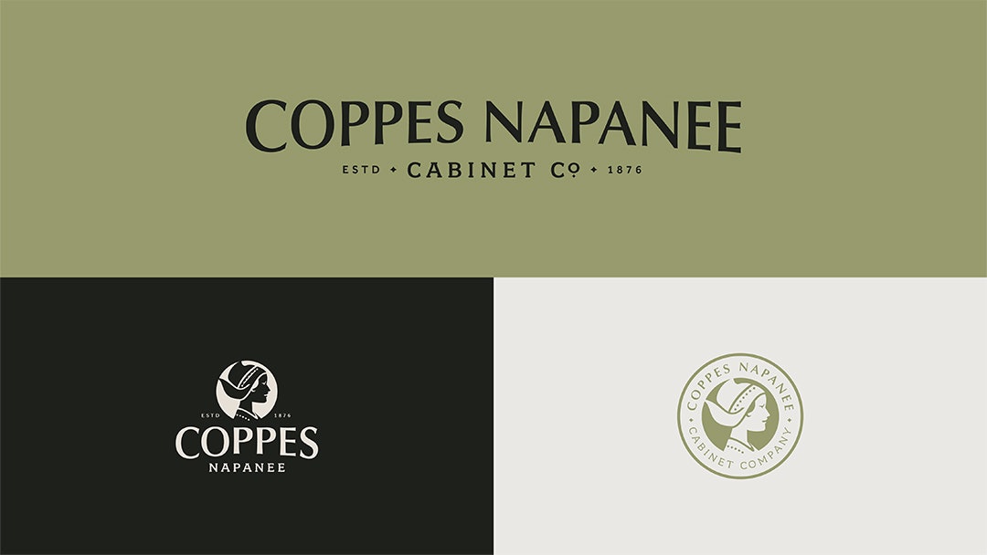
Logo Development
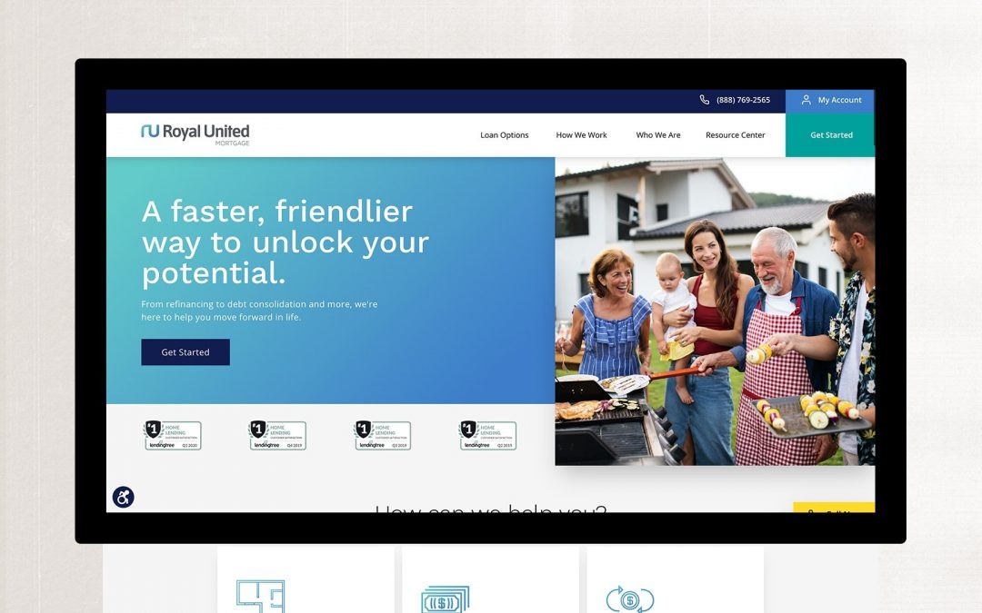
Website Design
Email Design
While we’ve worked hard to build and develop our internal culture at Royal United Mortgage, our customer-facing branding was falling short and didn’t accurately represent us in the marketplace. The work Element Three did to move our brand forward not only gives us the look and feel of a modern company, but it also matches who we are at our core.

Mike Keleher
CEO, Royal United Mortgage
STORY
Everyone deserves a great lending experience—even if they haven’t traditionally had one.
In 2008, Royal United Mortgage saw an underserved part of the lending market: individuals who struggled to get approved for loans via traditional digital marketing channels because they either didn’t want to borrow more money than they needed or they weren’t properly educated on what they qualified for. Since then, Royal United has made an unwavering commitment to serve and educate customers on how to get the loans they need when they need them.
BUT THEIR BRAND WASN’T TELLING THAT STORY.
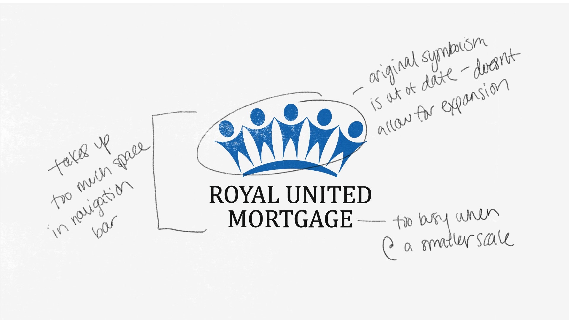
But without knowing Royal United is a viable option, underserved and unnoticed customers are left to turn to lending aggregator sites that decide in one or two online questions and answers if the customer is approved or rejected. Two questions and they hit the end of the road; that’s infuriating.
NO WONDER THE TRUST GAP IS WIDENING.
Since the Royal United brand is all about people and relationships, we dug into the people and emotions of their target audience.
Independent research shows that the gap between consumers who trust businesses and consumers who don’t is widening. At best, people looking for a loan are likely to experience predatory and overwhelming outreach and approval processes that feel purely transactional. At worst, they’re completely ignored and rejected.
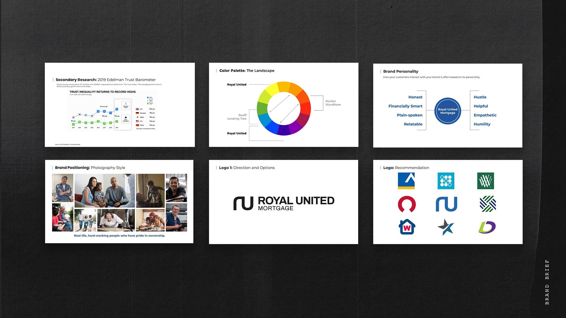
THE GAP CAN BE EVEN BIGGER AMONG ROYAL UNITED’S CORE CUSTOMERS.
By now, you can probably guess that the people who are perfect for Royal United’s style of lending fall well within the gap of trust and overall feel grossly underserved. While they understand how easy it is to get information, they prefer personal interaction in their loan experience over mobile apps or websites. And their biggest fear is being taken advantage of.
SO HOW DO WE GET ROYAL UNITED’S HUMANITY ACROSS TO THE RIGHT HUMANS?
Keep all the empathy, add lots more confidence.
Just like Warby Parker, Casper, Cricket, and so many others, Royal United is a challenger brand. And challenger brands have been known to not only connect deeply with their customers, but also turn entire industries on their heads.
WHAT’S A CHALLENGER BRAND?
- Challenge the status quo of doing business
- Set out to treat and serve customers in new and satisfying ways
- Add meaning beyond pure profit.
Challenger brands get tons of clout for thinking differently. But they still have to present a professional, modern experience. So our goal was to reframe Royal United as the smart, transparent, ethical challenger they are.
OUR GOAL IN A NUTSHELL:
Overhaul the brand, but leave the service process alone. See if we can increase conversions.
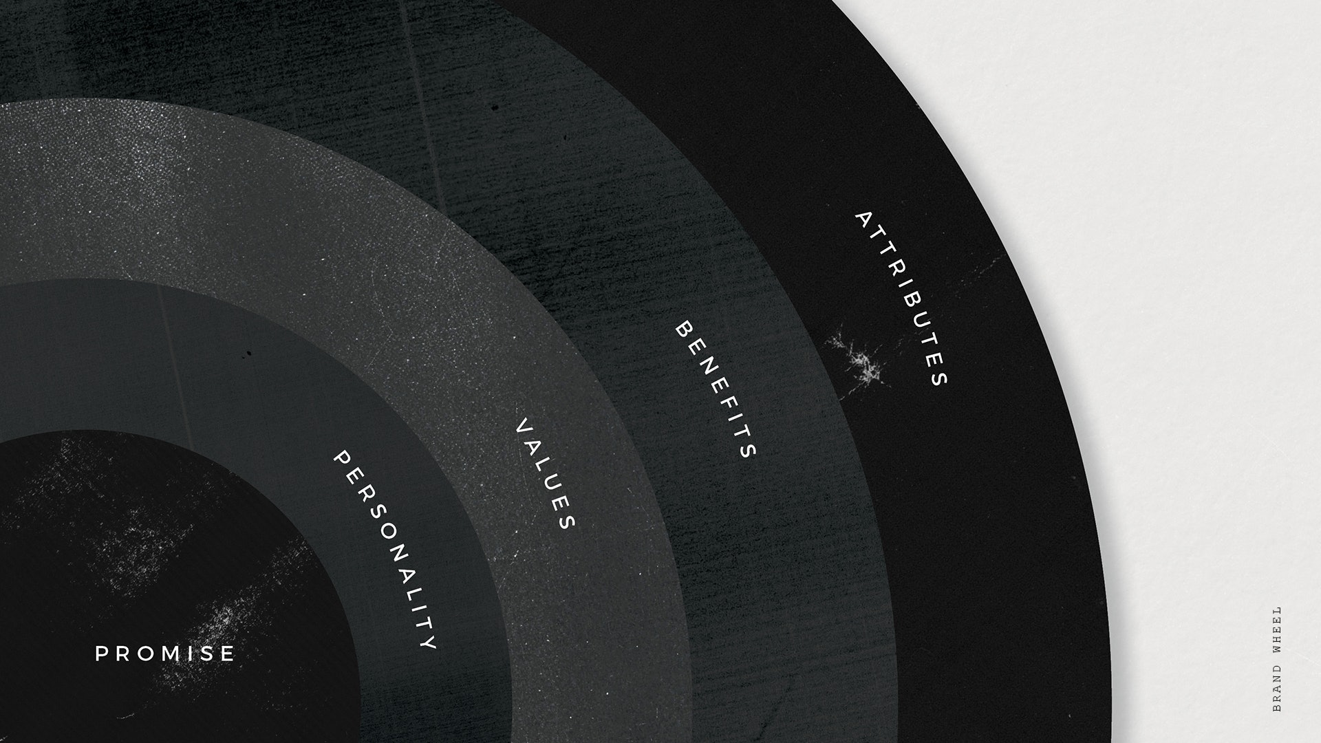
WE DIDN’T INVENT THE BRAND WHEEL. BUT WE DO USE THE HELL OUT OF IT.
We’ve all heard Simon Sinek say, “People don’t buy what you do. They buy why you do it.” And that’s what the brand wheel ties together: all the whys and the values and the humanity of a brand. To get there, we went through a deep dive of discovery with internal and external stakeholders and heard it all in their own words.
The core of Royal United is real people in real situations. Jams just happen; people often need some extra help. Royal United is the trusted guide who understands.
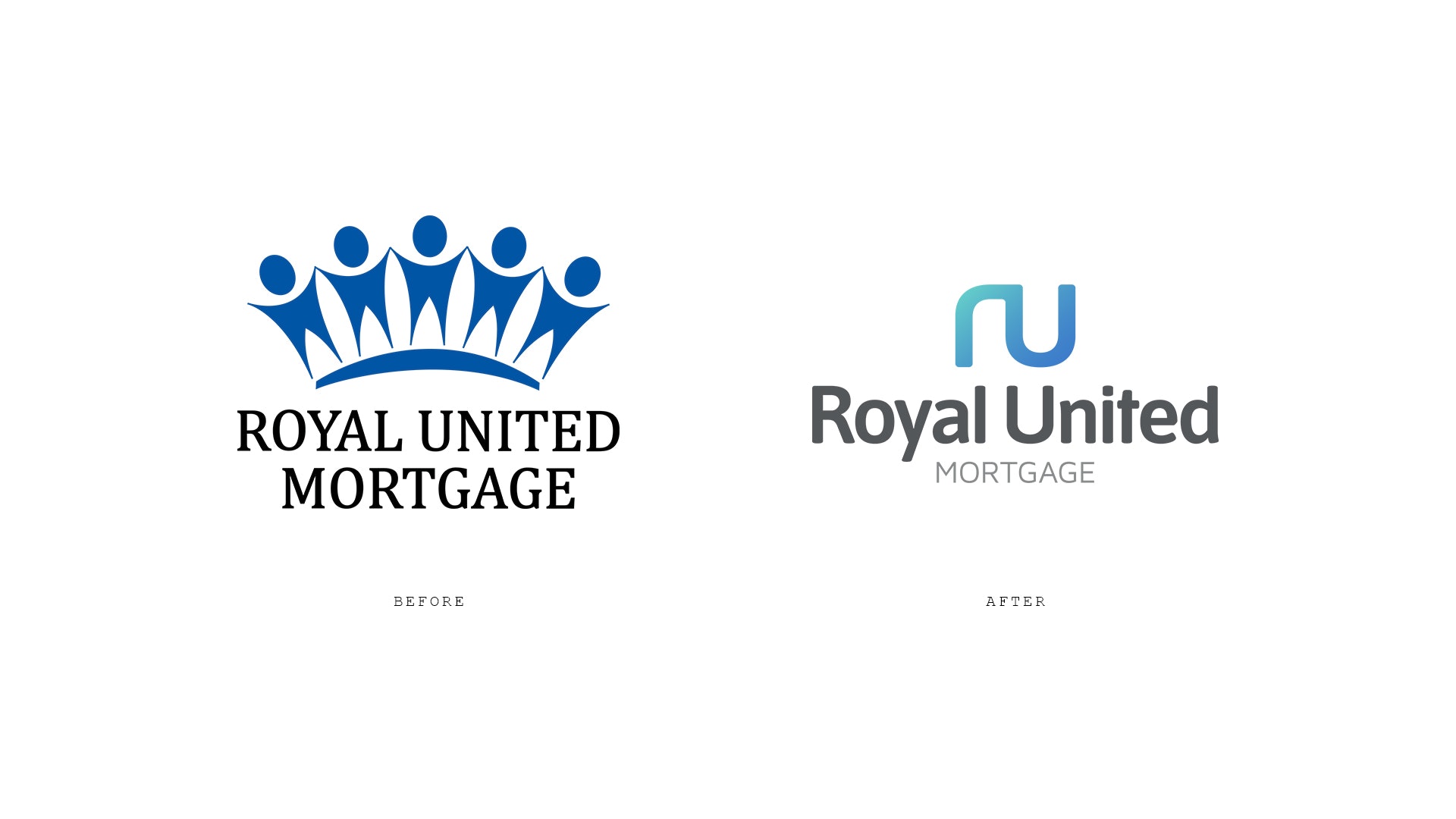
SO THEN THE WEBSITE HAS TO INSPIRE TRUST AMONG THE DISTRUSTFUL.
Right away, Royal United’s target audience needs to see themselves, both visually and verbally. They need to hear that their goals come first and that they matter in the approval process. They need more than just a couple of question boxes.
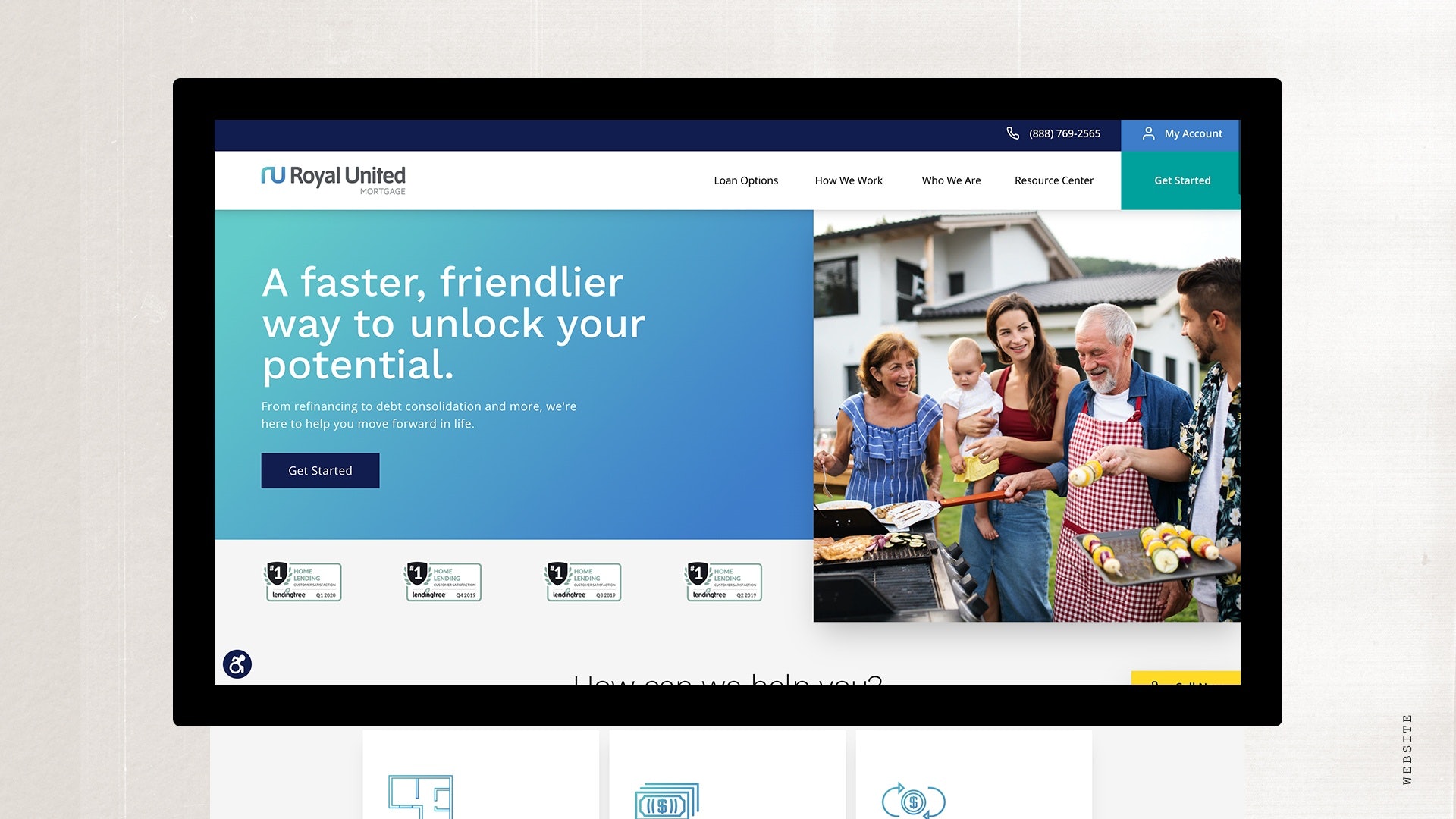
AND THE BRAND ELEMENTS NEED TO STAND CONFIDENTLY AMONG THE REST OF THE INDUSTRY.
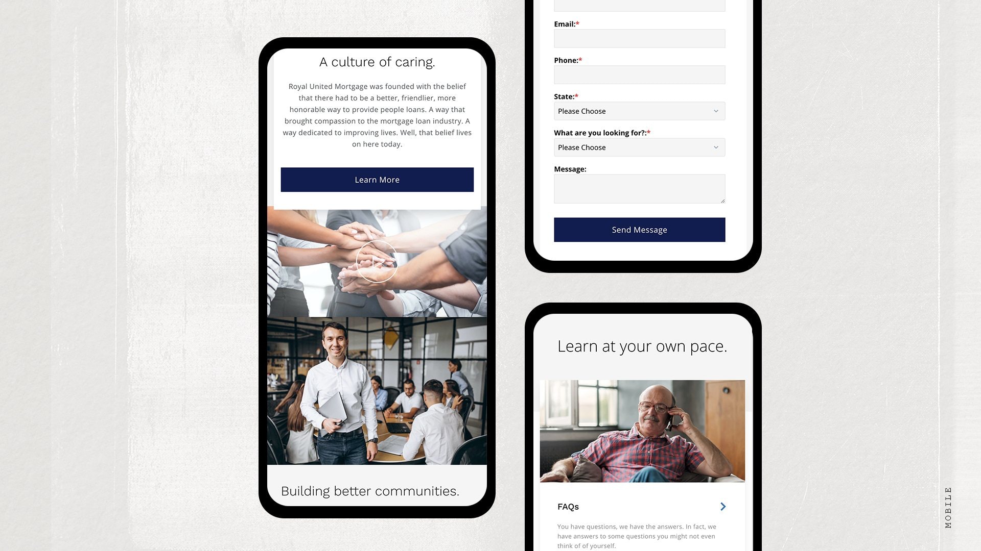
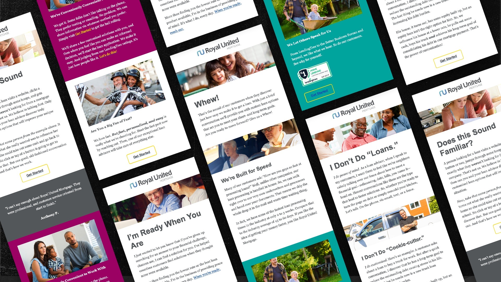
AND THE PRESENCE HAS TO EXTEND BEYOND THE WEBSITE.
Follow-up is just as important as the first impression in the lending industry because it either reinforces who you say you are or your reputation immediately falls off a cliff. We like the former way more than the latter, so Royal United’s emails got the same professional strategic treatment as the rest of their online presence.
A new brand, a bright future.
Royal United Mortgage began rolling out its new brand in the spring of 2020. And while we’re still waiting on data to see how the updated brand is performing in the marketplace, we’re ecstatic that their team is excited about the new look and website.
In the past, we rarely used the website as a reference tool when talking to prospects about our process. This rebrand and updated website gives our loan advisors a resource that they actually want to use and share with every customer they work with.”

Gabe Allen
President, Royal United Mortgage
Related case studies.
Start getting better results.
Take your marketing to the next level. We can help.
