Reinventing a Website to Get Results
Boston Whaler wanted to give their users a better online experience. Here’s how we crafted their award-winning website.

OVERVIEW
99%
Increase in overall website traffic
130%
Increase in Dealer Contact SQL form submissions
#1
Winner of 2016 Neptune Award for Best Website
Giving a lift to a sinking site
Known as the “UnsinkableLegend,” Boston Whaler creates beautiful, reliable boats. But while experiencing a Boston Whaler on the water is second to none, the brand’s online experience needed some love.
With a non-responsive site, multiple domain names, lackluster traffic, and outdated interactive tools, consumers and dealers alike were frustrated.
We had plenty of work to do.
Crafting the foundation.
An industry leader for 60 years, Boston Whaler needed a site as solid as their famous foam- cored boats.
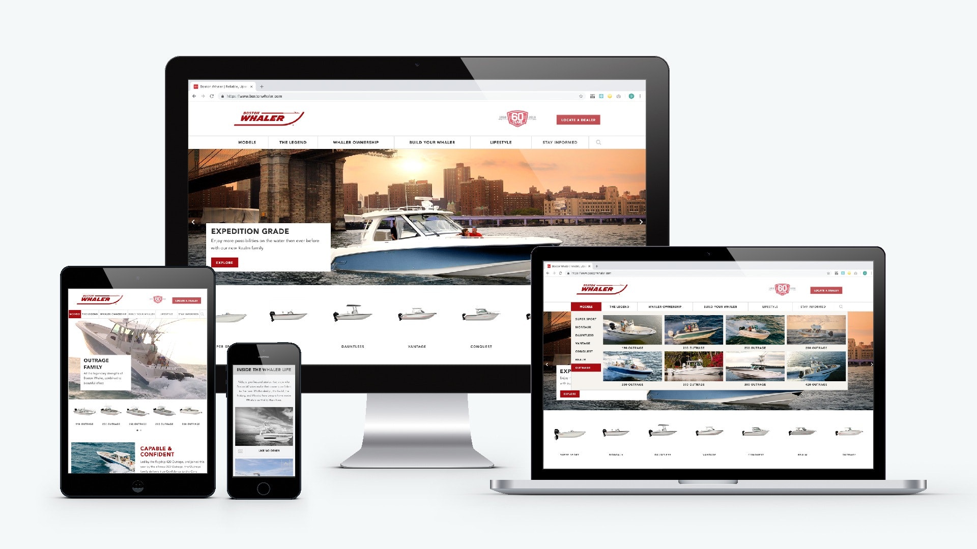
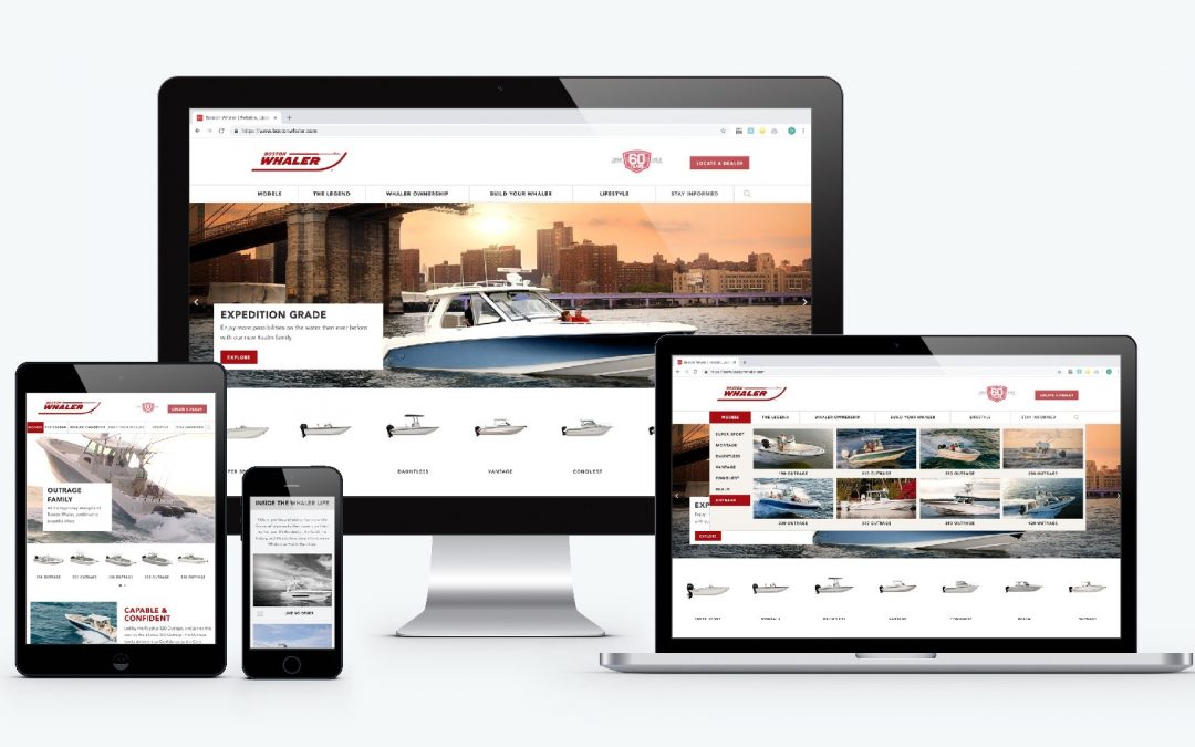
We started with the foundation, improving the overall site architecture by moving all assets under one domain. After restructuring the content, we worked to modernize the overall look and feel by creating a responsive design meant to improve the user experience across all devices.
Then, we made the most out of Boston Whaler’s incredible photo library by splashing ample lifestyle and product images across their entire site.

From common pain point to thriving engagement hub.
As if a website redesign wasn’t enough, we also took on the “Build Your Own Whaler” configuration tool. Aimed at consumers and dealers alike, the Build Your Own Whaler” tool serves as Boston Whaler’s primary sales resource.
To make the experience worthy of the Boston Whaler name, we added a few elements. Things like a mobile version of the tool, real-time customization features, and 3D graphics that allow users to see their creation from several different angles. To wrap a bow on it, we gave users the opportunity to download a PDF of their creations, share them on social media, email the results, or contact a dealer.
For the first time ever, shoppers were able to make the Whaler of their dreams come to life right before their eyes.
High style meets smart strategy.
We knew that Boston Whalers’s new site needed to look good and drive leads. So we created forms and landing pages focused on accurately capturing MQLs and SQLs. Once those leads were captured, we dispersed the most qualified to the dealers who could help them find the right product.
Element Three delivered a dramatic digital transformation—a responsive, modern approach that not only enhanced the user experience for our prospects and existing customers, but drove real results, too.
Nathan Abdalian
Director of Customer Experience, Boston Whaler
Results-driven recognition.
Boston Whaler’s new website hit all of the goals of the project, increasing traffic and leads while offering a mobile-friendly responsive design and revamping the “Build Your Whaler” tool. Overall, traffic increased 99.06%, “Have a Dealer Contact Me” SQL form submissions increased by 130% and “Request a Quote” SQL form submissions increased by 1245.45%.
After Element Three’s redesign, Boston Whaler’s website was recognized as best-in-class within the boating industry and won the Neptune Award for Best Website in 2016.
Related case studies.
Start getting better results.
Take your marketing to the next level. We can help.


