

Contrary to the cries that email is dead, in 2017, Radicati Group estimated that 269 billion emails were sent each day. Let that number sink in. To me, that means that a single email has a lifespan of minutes, fighting for the click with the hundreds of other promotional emails hitting our overflowing inboxes.
Bottom line: email is competitive. So if you do crack the code and earn the open (which is another discussion for another day), you’d better make sure that what’s inside doesn’t disappoint the user. And that starts with creating a great email template.
There are some bad, ineffective email templates out there. Here’s a few tips to ensure yours isn’t one of them.
1. Design for Multi-use
I firmly believe in working towards developing an email template once. If you want to get the most bang for your buck with email, keep development time low.
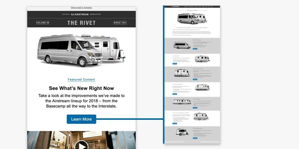
To do that, work on flexible templates. That is, sections of the template have “on/off” switches on the backend that allow for content to be easily added or removed. For instance, on a newsletter template we’ve created for one of our clients, we have room to promote a minimum of five pieces of content, but up to 15.
Some months might be slow for your product or service—you might only be writing blogs. Other months, there might be several webinars, events, product announcements, and other content to promote. Creating a flexible template to accommodate those fluctuations will help avoid having to develop a new template each month.
It’s also smart to avoid merging text within your images. When you choose to save text within images, that means (in most cases) only a designer can update email assets, creating a potential bottleneck in the process and additional hours being used for something that is read, then deleted.
2. Less is More.
Mailchimp recently released a study on their most popular templates in 2017, and the winner wasn’t the multi-column image-heavy template. It was the single-column with header.
A single column can be used to:
- Promote a piece of downloadable content
- Follow up a download
- Send a customer survey
- Announce an event
- Share a letter from a senior member of your company
Keep copy concise and to the point. Your copy should be skimmable. As people’s attention spans continue to rival a goldfish’s more and more, you want to get them to the button to click sooner rather than later. In fact, when we consolidated and cleaned up both messaging and CTAs in Airstream’s newsletter, they saw a nearly 25% increase in CTRs across all devices.
When it comes to email, don’t overcomplicate things. Keep it simple.
3. QA Emails in Top Inboxes
Before you design a new template, do an analysis of emails you’ve sent in the last six months. Ask yourself:
- What are the top inboxes where opens are happening?
- What are the top inboxes where clicks are happening?
- What is the ratio of mobile/desktop opens and clicks?
Email is tricky because each inbox has its own set of rules, requirements, and shortcomings. You can’t make the perfect email for every single inbox, but you can prioritize inboxes that will have the most eyeballs. For B2B companies, Outlook will probably be a big consideration. For B2C, it’s likely some combination of Apple Mail (desktop and mobile) and Gmail.
Use a tool like Litmus to see how your emails are going to render across a variety of inboxes.
4. Establish Brand Guidelines for Email
Minimize the headaches that accompany assembling emails by figuring out—and writing down—guidelines for emails. For instance: what is your fallback font? What colors can headlines be? What color will buttons be? Are there different colors for different offers? What style of photography will be used?
It doesn’t have to be very complicated, but at least have it written down somewhere.
5. Remember Your Audience
Most people aren’t technologically savvy. And as digital marketers, we tend to think that if we can figure something out, the average person can, too. But that’s just not the case. Digital marketers spend all day on the web—interacting with various websites, platforms, emails. The average person doesn’t.
Designs need to be stupid simple.
Don’t make your buttons so small that only toddlers would be able to press them on a mobile phone. In fact, consider making headlines, links, and images clickable. It lends itself to chubby fingers better.
And make sure all of your copy is sized so that a normal person can read it without having to be super zoomed in. And by normal, I mean a baby boomer.
Make Your Next Email Your Best Email
Just getting someone to open an email is tough, but once you’ve done that it certainly doesn’t mean your work is done. The inbox is a battlefield, and the best way to make sure you get and keep your reader’s attention is to start smart, with a great template. Even if you have the right copy and a smart CTA, your template could be the difference between a successful send and a response rate that you need a microscope to examine. Get your templates in order, and you’ll be well on your way to success in your next email campaign.