Great content will drive traffic, engage users, and convert prospects into customers. As more and more conversions are happening online, content marketing strategies are more prevalent than ever. But having a plan that solely focuses on what you are saying and not why and how is a missed opportunity. In fact, incorporating great visuals into your content marketing strategy can dramatically impact your overall success. Here’s just a few things elements like imagery, color, and other design components can do for your content.
Meet your goals
Each piece of content you have should help you and your customers achieve your goals. Say you’re developing a travel guide ebook. This should fulfill a user’s goal (“I want ideas on where to travel in my RV”) and help you as part of a larger goal (“I want to be known as a lifestyle brand”).
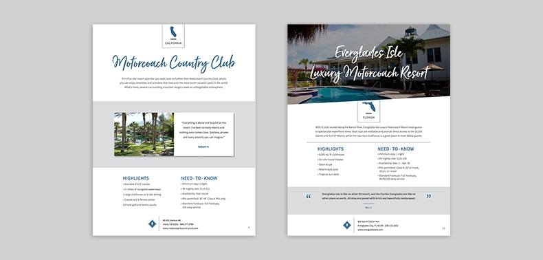
With goals established, visuals can be used within your content to help guide the user, highlighting information that is most relevant to the question your content is trying to answer. For example, let’s look at Newmar’s RV Resort Guide, a piece of content Element Three created for the luxury RV manufacturer. Before the team even started creating visuals and copy for the guide, a list of information the user would be looking for was made.
It included things like:
- Location
- Brief, engaging description
- What the resort actually looks like, and
- Quick facts
Once the most useful information for the user was identified, the content and design could work together to create a piece that quickly communicates information to the viewer. The result? A piece of content that successfully communicated that important information and helped promote Newmar’s brand. Win, win.
Newmar’s RV Resort Guide. To see more, check out the case study.
Back your message up
You have your best -in-class product or service and you’ve been working hard to get your message out there, but how do you really show people what you’re all about? Videos and interactive content are a great way to do this. Not only are they more visually engaging, but they also allow you to show off your subject matter expertise on a deeper level.
Here are some ways you can use interactive content as a visual element to support your messaging:
- Product videos: 73% of adults are more likely to purchase a product or service after watching a video about it. When you show people what they’re going to get along with the features and benefits, it comes across much more clearly.
- Pricing calculator: Transparency is increasingly valued by consumers in the marketplace. Being upfront about the cost of your services will go a long way toward building trust in their minds (see Synovia’s pricing calculator).
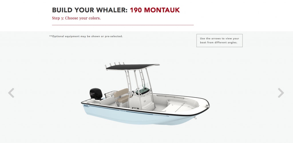
- Customizable product builder: This works especially well for high-end products. When a prospect is looking to make a large investment, showing how your product is customized to their needs is a great differentiator.
Inform the User
Using visuals to expand and highlight your content can help inform and educate your viewer, especially when dealing with complex subject matter or long-form content. Because a magazine fits squarely into the definition of long-form content, it can be tempting to throw the copy into a three-column layout and call it a day. Fight that urge and really think about how design choices can improve the viewer’s experience.
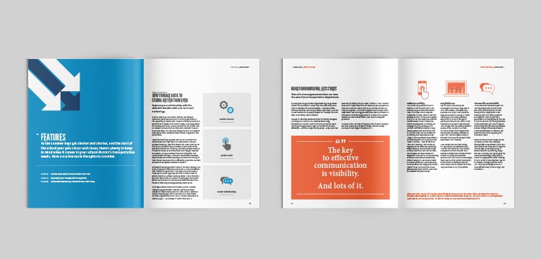
In 2017 we assisted our client Synovia Solutions with the publication of a digital magazine for the telematics industry and used copy and design together to inform at several key points:
- Navigation: Just like a website, your viewer should be able to move easily through your content. Incorporate a table of contents and consider section names on every page so people know where they are. Section lead-ins can also be used to give the viewer a preview of the coming pages.
- Images and illustrations: Using a picture to present information increases retention to 65% three days later, over 10% if you’re just using text
- CTAs: We’re encouraging people to take action here, so we should pay special attention to how they’re treated. Avoid generic language and give them a different visual treatment so they stand out on multiple levels.
Identifying how content and design can work together to inform your prospect better won’t be a clean process; there should be some back and forth as content is developed and tested. But the constant push to identify the most important information for your end-user will help make your content valuable.
A digital magazine created for Synovia Solutions.
Content Marketing Is More Than Just Keywords
In the quickly changing advertising landscape, content marketing can seem like a numbers game where success is all chance. A good marketer knows that a campaign blueprint, SEO strategy, and user testing can all help you meet your goals. But even then, how do you stand out from the crowd? Approaching content marketing as a collaborative effort where the visuals and content work together to help you achieve your goals, inform the consumer, and back up your message will put you well on the path to success.


