Many web designers like myself have a happy-medium, lukewarm relationship with coding. If coding were Spanish, we could make our way through daily life (lots of “holas” and “lo sientos”) but we certainly wouldn’t be fluent enough to avoid embarrassing ourselves in front of the native speakers on a daily basis (aka the dev team laughing behind our backs).
A third complexity is brought into the language barrier situation when we communicate web design work to clients or, for in-house marketers, to stakeholders. Clients and the higher-ups can’t be expected to learn a new language in the span of a project, so it’s our job as web designers to understand it to such a degree that we can explain and translate issues clearly.
Many of the reasons why we can or can’t accomplish design elements are related to the underlying code of a page and the way it’s built. Translating the “why” between developer, designer, and client or stakeholder becomes integral to the success of a project when communicating across two languages.
Learning Through Browser Tools
Teaching yourself how to code will get you closer to “design unicorn” status, but a basic understanding of the language will get most designers through as long as they are working collaboratively with the developer. And as much memorizing of tags and as many basic video courses as I take, I’ve found that most of my learning happens in projects with a few simple and free browser tools.
There are tons of plugins and extensions that you can slap on your browser (check out our dev team’s recent favorites), but the ones I’ve found most helpful for understanding code structure and communicating web page design are: Inspector, Full Page Screen Capture, and Browser Width. With these three basics, I’m able to understand how to access and manipulate the code behind my work and communicate it clearly so life becomes easier for my development team, my clients, and myself.
#1: The Inspector
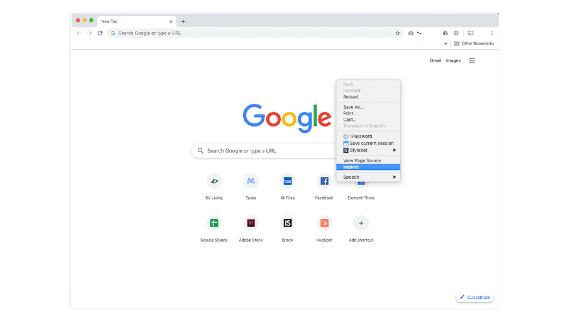
The “Inspector” tool exists as part of every browser’s developer tools. Using the Inspector tool is as easy as opening your browser, right-clicking on a page element, and selecting “Inspect Element.”
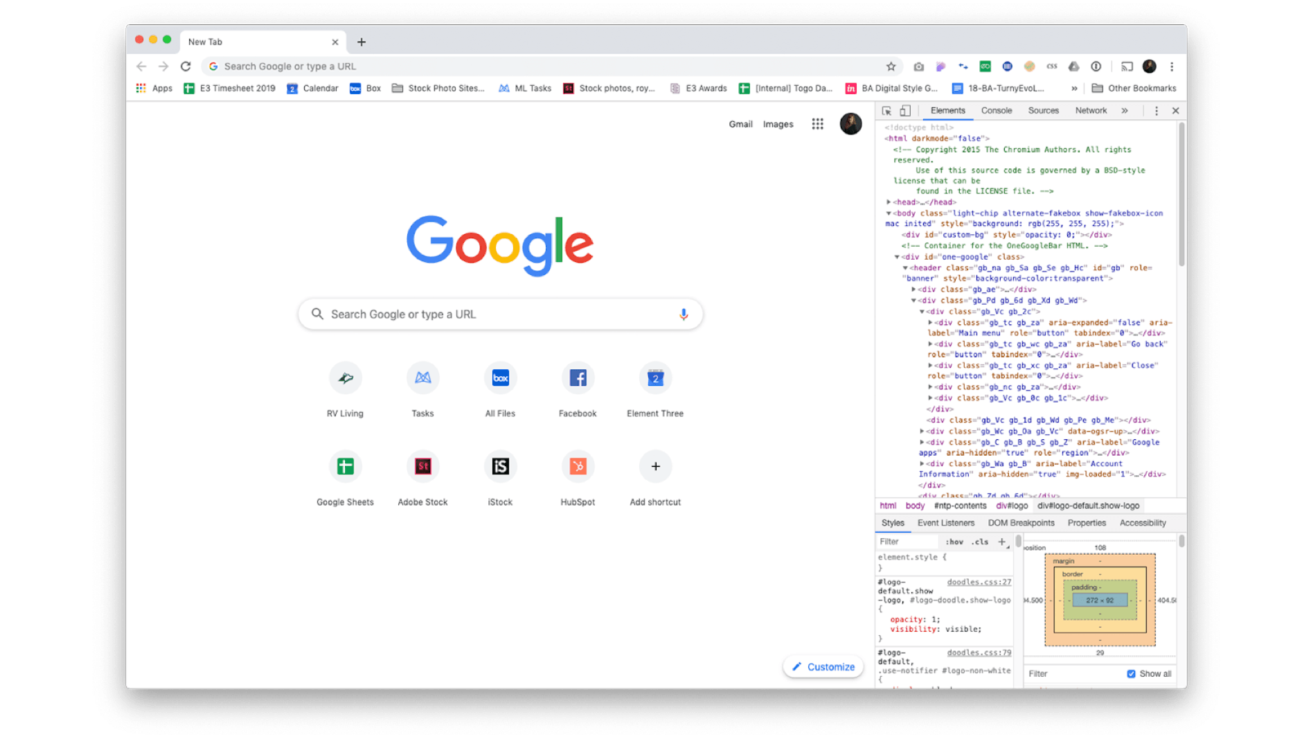
The Inspector window will show the HTML of the live page as well as the CSS that’s applied to each element on the page. Using the Inspector, you can instantly change HTML and CSS elements and see your changes reflected live on the page. Your modifications won’t save, so this gives anyone with a laptop a non-destructive playground to mess around with the code.
So let’s say you’re in a situation where you’d love to see what the H1 would look like just a TEENY bit bigger. Guess what? You can right-click, inspect, and manipulate that code (font-size: 32px to font-size: 36px) and see it live! This can also be handy for your resident copywriters if they want to test headline length and character count live.
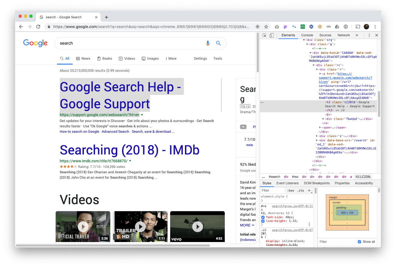
This can be a huge time saver for you and the developer when you’re at the QA stage, as it allows you as the designer a live, nondestructive testing ground for web styles. Rather than the constant back-and-forth nudging of font size and padding, you can pinpoint, determine, and hand over an exact value (e.g., “Update to padding-top: 30px;”). Inspecting the code will also give you specs on image sizes, color hex values, and other quick insights to a company’s brand that can be helpful on the fly.
The Inspector tool also gives designers a better sense of the container structure (think divs) on a live page. This can be especially helpful when trying to identify the location and amount of margin and padding on specific elements or sections on a page. Hover over elements in the Inspector code to see where they exist on the live page. Click down into divs to see more specific areas of code and styling. You can also right-click on specific elements on the page and the Inspector tool will locate where their code exists.
#2: Full-Page Screen Capture
The “Full-Page Screen Capture” plugin (Chrome, Firefox) is a great tool for recording and referencing web pages. Unlike a regular screen capture, this extension will scroll the whole page and capture it in one tall image. It’s specifically helpful for mocking up and recording web work, especially when you need to annotate pages for func docs or additional client explanation.
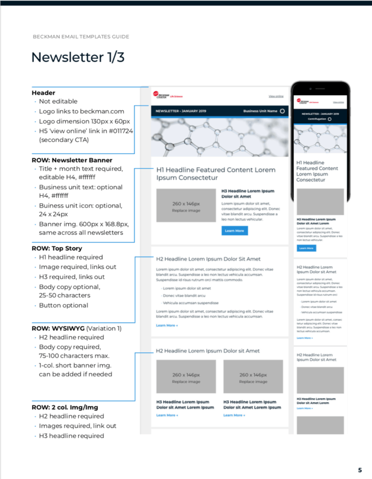
For developers, full-page screenshots allow you to accurately mock up and annotate work for functionality documents.
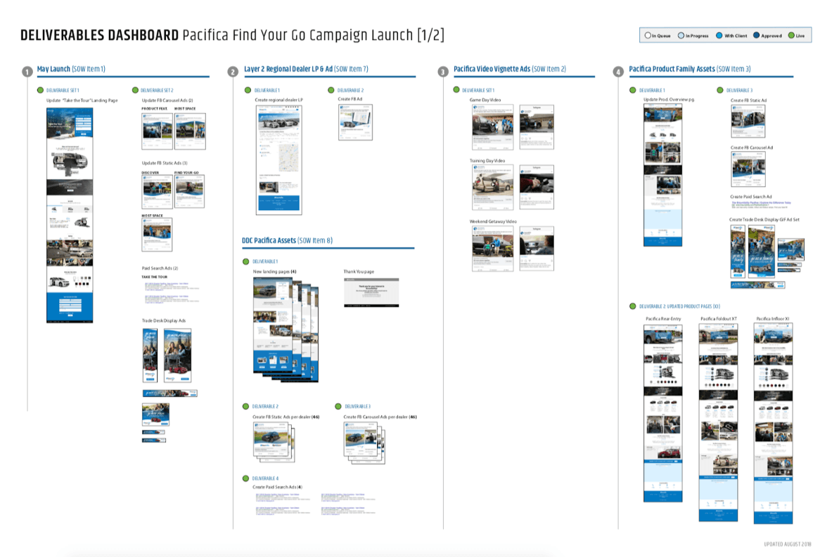
For stakeholders or clients, full-page screenshots help encapsulate work being done over the span of a large campaign. Here’s an example from our work with BraunAbility.
A caveat: Don’t get too caught up in the full-page height view as you work. Remember that users experience pages in a scroll, so you should always be referring to a live scrolling version of your design when considering UX and design specifics.
#3: Browser Width
The “Browser Width” tool (Chrome, Firefox) can be used in tandem with full-page screen capture. It allows you to adjust to an exact pixel width in-browser, which helps when working on responsive projects. It’s also handy for keeping your browser width consistent when designing or referencing other projects. I find myself using it the most for initial wireframing of responsive sites and when referencing break points on other websites.
A Quick Summary of the Why
Using these easily accessible free tools when you’re researching, learning code, or communicating details to a client or stakeholder will help you gain a better understanding of how websites are built. Designers can only benefit from getting a behind-the-scenes look into the structure of what they’re creating, and from being able to manipulate code in a totally safe space like the Inspector gives you—a playground to break code and make mistakes with no consequences. Stay curious about the code you are building in and you’ll find that it will benefit you, your co-workers, and your work.


