

The web just keeps getting harder, better, faster, and stronger, and that’s mostly due to browsers. Browsers are advancing and adopting new features more rapidly than ever before, giving developers the ability to create better experiences for our visitors without having to wait years for full browser support.
So, what does this mean for you? This means that in 2018, if you or your development department see announcements of CSS and JavaScript advancements and you ignore them—because you’ll “pay attention when they can actually be used”—your deferment is unnecessary. In fact, you could actually be deferring a better user experience on your site. For years.
In this post, we’ll examine three specific CSS features that have been introduced fairly recently: Flexbox, Calc, and Grid. We’ll look at why your team should be welcoming these new features and how implementing them can improve website performance—both real and as perceived by the user.
Flexbox
Let’s say you have a row of three images with associated text and buttons below them. This is a pretty common layout.
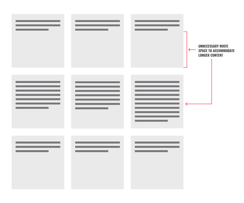
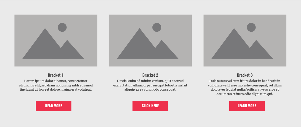 Notice how the copy is a line longer in the third column, yet all the buttons are bottom-aligned. To accomplish this in the past, a developer would have to write several lines of annoying JavaScript. The code would find the height of the tallest column and then set all of the columns to that height. This approach has several negative implications:
- While the page loads, the buttons would not be bottom-aligned for a moment. Then there would be a brief, jarring adjustment when the buttons snapped into place.
- If you had several rows of content with widely varying copy lengths, every single row would be the height of the tallest “cell,” which may make some rows look odd.

- The height would need to be recalculated every time the screen was resized or rotated.
- If you wanted to add more JavaScript functionality to this section, such as a show/hide toggle or a carousel, you’d need more JavaScript on top of that to keep recalculating the height.
- There is so much JavaScript being moved around on the web today that every time you add some, you run the risk of it potentially conflicting with some other script down the road.
Flexbox solves all of this for us by supporting this type of layout by default. Cells in each row automatically expand to match the height of the tallest cell in the row. Because this is done with CSS, the buttons don’t need to snap into place while the page loads—they simply are where they need to be from the start. Secondly, each row would dynamically resize independent of the others.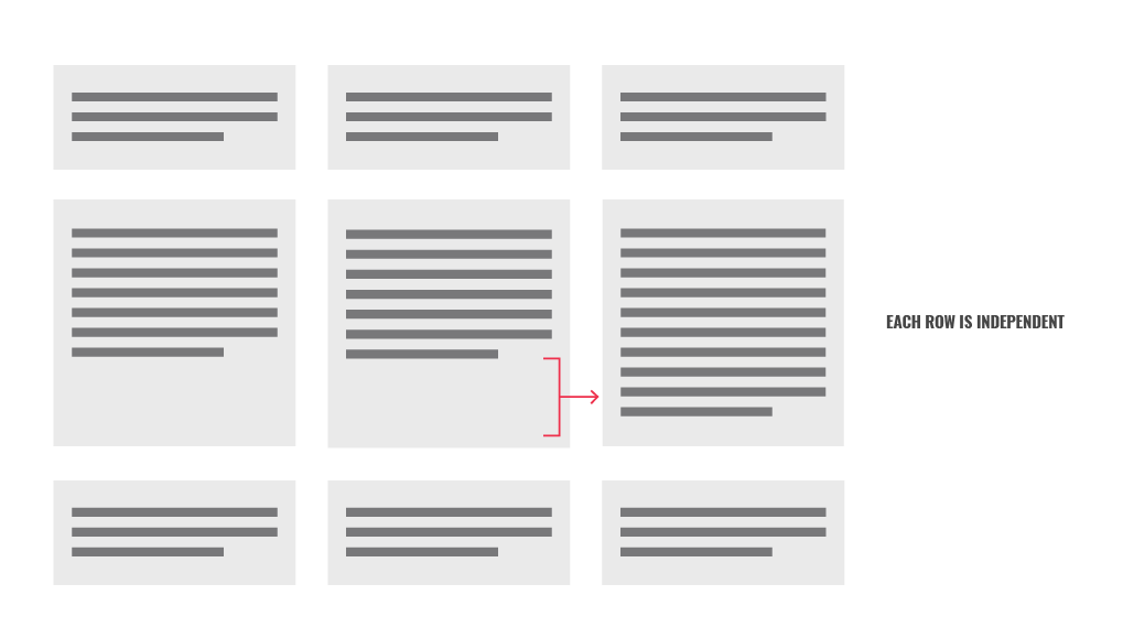 On top of all that, the page would actually load a little faster since we don’t need that JavaScript anymore.
Bottom line: if your developers aren’t leveraging the power of Flexbox, you’re missing out on an opportunity to improve things like user experience and even page load speed.
Flexbox + Calc
Now, let’s say you have a layout like this:


Notice how there’s an invisible boundary on either side of the content, yet the gray background on the right extends all the way to the edge of the screen. To accomplish this in the past, a developer would have to write even more annoying JavaScript. The code would subtract the inner content width from the screen width, and divide that by 2 to get the pixel width outside of that imaginary boundary. That pixel width would be set as the “right padding” of the right side, allowing the gray to extend to the edge of the screen. Here are the cons of this approach:
- More JavaScript would be needed to handle the display of this section while the page loads. Because the width wouldn’t be set until the JavaScript is executed, this section would be unusable until that happened.
- Still more JavaScript would be needed to set both sides to the same height, similar to the previous scenario where we looked at just Flexbox.
Flexbox solves the aforementioned issues, while Calc allows us to perform this width calculation—(screen width – content width) ÷ 2—in CSS. All the benefits of this are the same as before: a more content-proof layout, no snapping into place, faster load times, etc.
Calc has been fully supported by all major browsers since 2014, and Flexbox has since 2015.
Caveat: Granted, a few workarounds have to be implemented for Internet Explorer 11, even more for IE 10, and IE 9 and below don’t support Flexbox at all. So if that’s a large chunk of your user base (you can find that information in Google Analytics), you won’t be able to use Flexbox. However, in 2016, Microsoft ended support for every version of IE except 11, so the percentage of users using older IE versions is declining by the day.
Grid
Grid is basically a more advanced Flexbox. One key difference is that it allows you to set a gutter—the space between columns and rows—as opposed to using some weird combination of margins and padding to get the same result. Both Grid and Flexbox allow for cleaner HTML and greater flexibility for layout changes due to responsive breakpoints, dynamic content, etc.
Looking at the timeline for Grid on caniuse.com, you start to see partial browser support in spring of 2017, with full major browser support arriving in fall of 2017. Compare this to the timeline for Flexbox, which took about three years (or longer, depending on how you look at it), and you can see that browsers are adopting new features much more rapidly today.
Embrace Change
As browsers continue to roll out support for new features, encourage your developers to start using them! A new feature could be a case for revamping a section of your site, which could have a dramatic impact on site performance and conversions. These exciting browser features are becoming universally adopted faster than ever—it’s time to start capitalizing on them.