

Being the smartest person I know, I get asked this question all the time: “Aw geez, Grady, how do you go making those super cool dashboards? Like, the ones VPs and execs, like, love and stuff?” Luckily you don’t have to be as smart as me to pull together actionable marketing reports from your data (though it certainly helps immensely).
For now we’re going to assume things have been tagged and your numbers are all pulling in correctly. That’s a whole other set of problems and skills to tackle, which we’ll follow up on in other blog posts. Back to building dashboards, though—let’s walk through why reporting dashboards are beneficial and how to get it done.
Reporting Dashboard Benefits
First and foremost, why invest in a reporting dashboard when you could simply pull metrics from each of your analytics platforms? While that’s certainly an option, you’ll be limited to the structured data those platforms are spitting out. Through BI software such as Domo, Tableau, or even Excel, you can find valuable nuggets of information and understand your entire marketing ecosystem through mining, merging, combining, and manipulating raw data.
Watch the video below, which goes into greater depth.
Now that you’re completely sold on marketing dashboards, let’s dive into creating actionable, smart reports that don’t just gather dust.
Do It for Mee Ma and Pop Pop (and Make Your Reports Easy to Understand)
Question: How would you respond if I told you my blog post got 100 sessions last month?
Answer: What is, “I have no context for this and thus don’t care?”
This is pretty much the cardinal sin when it comes to communicating marketing data. If you deliver a report and the next question that hits your stakeholder’s mind is something like, “What the hell does this mean for my business, and if we compare it to no baseline, how do I know what’s good or bad?” then there’s probably something wrong.
Since we as marketers live in a world of clicks, open rates, and impressions, we tend to want to communicate in those terms. In reality, though, most mid- to upper-level management couldn’t give a gursh dern about any of it; they want you to handle the minutiae and report back on how the marketing is positively affecting the business.
In the simplest terms, you should be developing reports that even your granny and gramps could understand, or at least the key portions of them. If you have to define the chart or its components to Pop Pop, then you’ve failed this test. If he sees sales going up and to the right, then he’ll probably invite you to go fishing with him on Sunday.
In the ideal case scenario, this would be accomplished by closed-loop reporting and full sales attribution, correlating sales revenue back to the key marketing tactics by the purchaser. If you deal in e-commerce it’s an easier functional task to accomplish since your activity primarily exists online. But if you sell retail, B2C, through a dealer model, or through the use of sales reps, things get really tricky really quickly.
Sidebar: With multiple systems and touchpoints across a sales cycle, custom tagging and attribution need to be put in place to correlate activity from one marketing platform to where your lead and sales data is tracked. Element Three specializes in this area, but the details are a little too in-the-weeds for this blog post. Get in touch with us for help in this area.
So, when starting to build out your reports, you should be sort of working backwards: if you want to prove and correlate sales to marketing channels, how would you do it with the data that exists?
Go Ugly Early: The Art of Understanding Your Data
Let’s say you want to make some lasagna. To best get that done, do you just look at a finished piece of lasagna and start cooking? Or do you try to break it down by all the individual components?
I’m a huge proponent of finding understanding, which I feel ultimately helps in the completion of a task or a project. Translating this back to marketing data, that means getting out of your comfort zone from third-party applications and visualization software and diving into your marketing data in a raw, unstructured format first.
When dealing with millions of lines of marketing data from all over the place, containing all kinds of metrics and content, it really helps to understand the naming conventions that your reporting software is looking at, across what columns, and the rough lay of the land. Not only does this help you ultimately create better visualizations (because you intimately know the underlying data) but you can simultaneously debug any tagging and tracking errors that come through.
Pull the Nth Dimension
Once you know where you’re going and how the data is formatted, you can start to pull the data into a table to then manipulate and visualize (in a sheet software, visualization platform, or even a delivery platform). To do this you’ll need to select what information to view, which is divided into Dimensions and Metrics.
- Dimensions: text-based divisions of your data
- Metrics: numeric values that correlate back to Dimensions in a given row
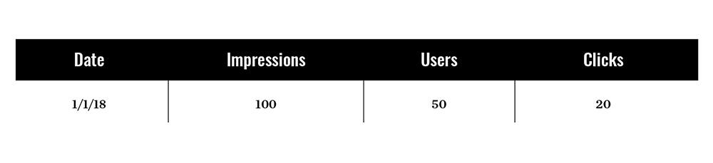
So, for example, if you just include the Date (a dimension) and three metrics for a single day, you would have a single row of data in a table:
But by adding another Dimension, which adds a new column to your table, you divide the info from your previous Dimensions into new rows. For example, if you wanted to see the split of users from 1/1/18 across devices, your data would segment down:
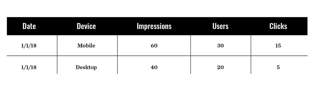
Now your totals would all be the same, but you have more context for the metrics and the usage therein. The more Dimensions you add, though, the larger your dataset becomes. So with just Date, your set would be 365 rows. Add a dimension with 2 options, and that dataset can double. Add another with 10 different options, and it can increase by 20x. Things get huge really quickly.
From my point of view as the data dork of Element Three, I lean towards including as many Dimensions as you can get your hands on. The reason is because even with the highest level of granularity across Dimensions, you can still add up all the numbers from a given dimension to get the grand totals. The difference is, you also have the ability to analyze to a high level.
The ability to correlate a given advertising channel, creative, region, or anything else to a sale is far more valuable than simply understanding a sale occurred. Doing so allows your marketing team to scale the right tactics and remove inefficient ones.
A Marketing Chart Is Worth at Least 200 Words
The last step, after delivery and communication, is the process by which you visualize your data. Some key things to remember during this phase:
- Start from the high-level business impact and work your way down to technical marketing data
- Try to include a trendline, year-over-year comparison, or goal line to frame the information being viewed
- Interactivity and additional filters are always cool, and allow your report recipients to engage in new ways
When thinking through your charts, try to find logical yet creative ways to display your information. Here are some of my go-to faves from a visualization point of view.
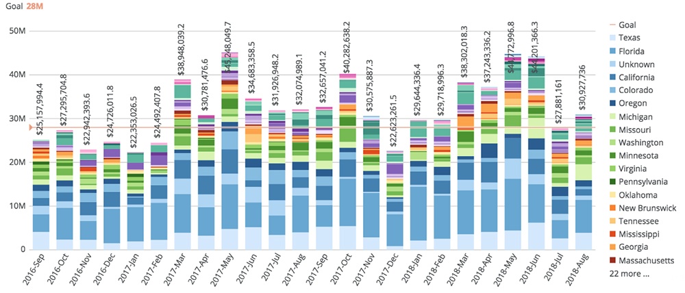
Stacked Bar Chart:
These bad boys let you see the logical format of a bar chart, but broken out by another dimension of your choice (in this example, sales by state). Over a given period of time, you can focus on the growth trajectory of a given marketing tactic or key demographic to determine success. Giddyup, Florida!
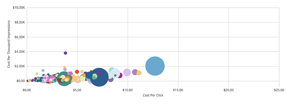
Bubble Chart:
Oh, bubs. These are great because you can see everything split across a grid, plus the third dimension as the size of the bubble itself. Depending on how your metrics and dimensions are split, the placement of a bubble on the chart either means it’s working or it’s failing. The graph below measures ad campaigns by CPM (cost per 1000 impressions) on the Y axis, CPC (cost per click) on the X axis, and CPA (cost per conversion, or acquisition) as the bubble size. Big blue on the right there has a really high CPC and CPA—maybe we should shut him down.
This Is Only the Beginning
A quick blog post can get us all on the same page for broad reporting tactics, but there are tons of details involved throughout every step of the process here. Setup, debugging, data cleansing, data correlation, big data manipulation, and automation are all components that get you to the final product of a knockout report. But thinking through the high-level direction first will help the end product that much more.