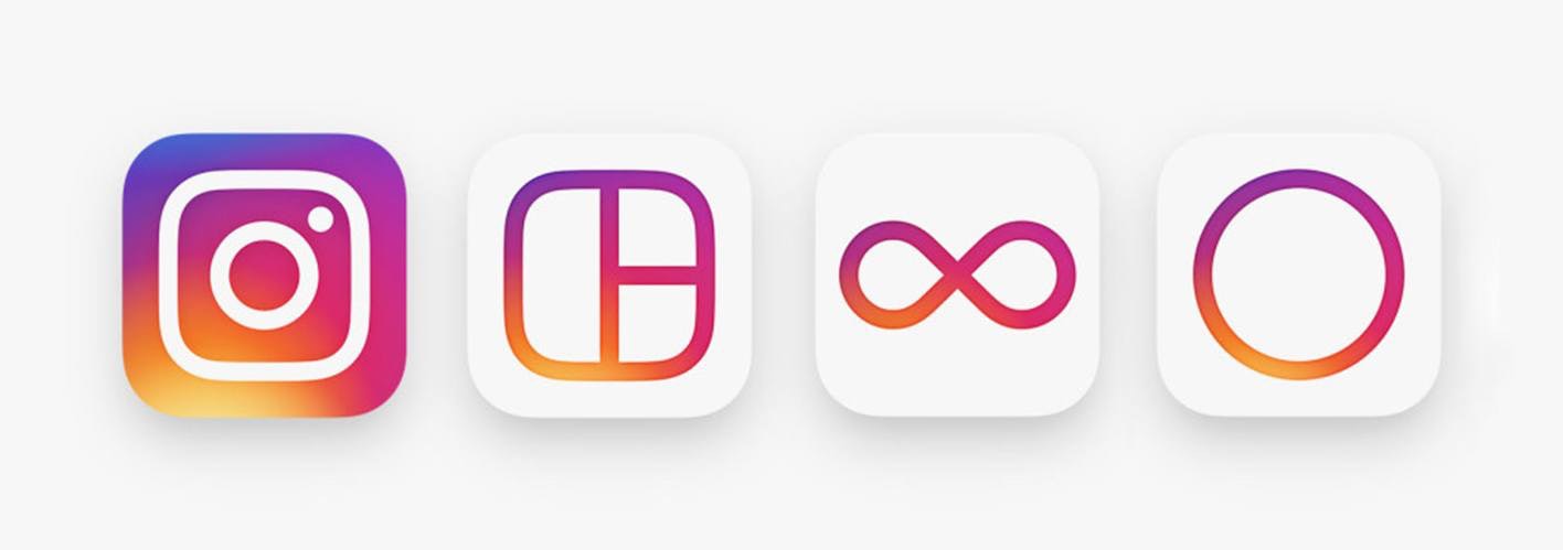
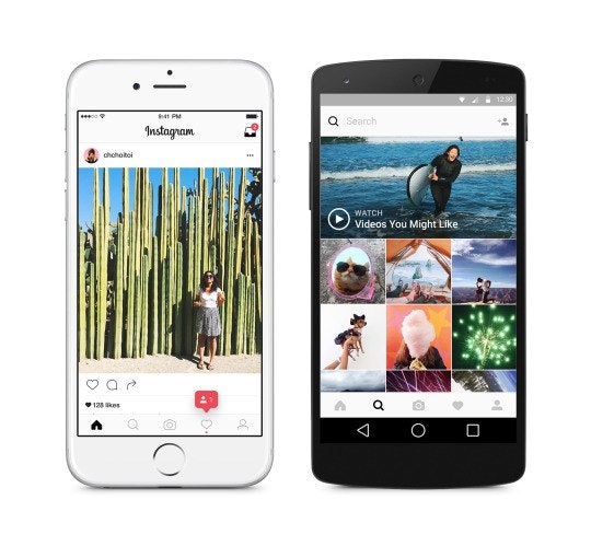
It’s official: Instagram has unveiled their brand-new (pun-intended) logo and user interface to the world. Whether you love it, hate it, or have absolutely no comment at all, the transformation and the reaction it caused dominated the social media world for weeks.
A redesign of this magnitude was sure to bring out droves of critics and supporters alike. As far as I’m concerned, I place myself in the camp of those that thought the rebrand was a huge success. Instagram simplified a symbol that was too outdated for today’s consumer’s expectations (Instagram’s target audiences probably don’t spend much time thinking about old film cameras), thereby focusing their attention on tech-savvy millennials and Gen Z’ers looking for the next best way to share their vision with the world.
Their decision seems to have paid off in the short-run: the positive reviews in the IGer community have far outnumbered their negative counterparts. But was the decision to evolve their brand worth the risk of alienating their existing users and advertisers? There is definitely no shortage of examples of company rebrands that have ended terribly; not to mention the many, many cases of apps and platforms that have attempted to improve their product, only to see these changes blow up in their face.
The Cost of Growing a Discernible Brand
Building a brand following isn’t only an incredibly difficult thing to do, it’s also a huge risk. Having a group of people of any size care deeply about your company and what it represents means that any change you make, no matter how small, is likely to elicit very strong feedback, good or bad. Plus, the larger its following, the more susceptible your brand is developing a counter-following – a group of haters waiting for their “got ya” moment where they can convince enough people that your brand is overrated, giving them the change to benefit from the “I told you so opportunity.” These risks are only amplified in the ever-expanding user economy, where a brand’s most important stakeholders engage solely via digital channels and often pay absolutely nothing for the relationship.
All of this leaves brands with two options: either they can lean into the risk that is brand evolution, or they can stagnate and just hope to milk as much out of their existing equity as possible before meeting their eventual demise. Clearly, there are more than enough examples of brands that chose either not to adapt or did so only after it was too late (notice this post is about Instagram’s rebrand, not Kodak’s). Somehow, I don’t think these outcomes are what their executives had in mind when they were choosing the safe route.
Calculated Risks
While on the surface, Instagram’s rebrand seems a little drastic, it’s pretty easy to see in hindsight that this is what we should have expected all along. For the last five years, Instagram has adopted Apple’s product development cycle: it only releases drastic changes roughly once a year (an eternity in the world of technology). They seek perfection, and achieve it by taking their time with changes to their product. They’ve similarly adopted the aesthetic approach of their parent company, Facebook, by simplifying their logo set and making a UI that permits their users to focus more on content creation than the platform on which the creation occurs.
Photo via Instagram
So after a year of development, built upon a well-established approach to change and progress that likely involved feedback from countless internal and external stakeholders and hundreds, if not thousands, of iterations: yes, Instagram unveiled a brand and user interface that looks drastically different from the brand and UI that people fell in love with. And they did so knowing they had not only a following that would back them up, but an even louder group of evangelists whose livelihood depends on the platform. Speaking personally, having seen early iterations of the simple black-and-white UI redesign on friends’ feeds when they were in test groups before the release, I couldn’t wait to get my hands on it. Sure, I might be biased toward Instagram as an IGer with a large following, but I developed my equity in this platform in the first place because it was such a great channel. These test groups – which generated excitement among people like me – were easily the best decision they’ve made.
Instagram’s rebrand was a huge risk, but it was well-calculated.
Was their redesign perfect? Of course not. Many people found the colored logo and brand mark to be an absolute travesty, solely due to the rainbow gradient that admittedly looks to be something out of Lisa Frank’s world.
Photo via Mental Floss
And all of this is not to say Instagram is in the clear. They still need to continue to drive the product they are providing. There’s a lot of potential yet to be developed that could drastically change the ecosystem and fate of the platform. But they have proven themselves willing to lay the groundwork for the future not only of the brand, but also of this product that serves a half a billion people and counting.
Filtering the Lessons from Instagram’s Rebrand
Change is inevitable. The most successful brands will continue adapt to meet the current and future expectations of their employees, customers, and users. What matters isn’t that Instagram rebranded – it is the steps the company took to ensure their risk would pay off in the end and the rebranding lessons we can take away from their efforts:
- Define the essence of your brand before you redesign its outward appearance. Instagram had already adopted a clear approach to design, usability, and improvement before they began making actual changes.
- Take your time. Ensure you’re making decisions based on long-term market trends, not temporary fads. Not every rebrand process has to take a year, but updates as drastic as Instagram’s should be thoughtfully considered before they are implemented.
- Test your new identity with actual stakeholders (including employees, customers, and followers) before and after rolling it out to the larger market. While most of us weren’t expecting Instagram’s rebrand, the company took the time to survey test groups of users so they could anticipate public feedback before it rolled out entirely. And even after launching the new logo and UI, they have continued to seek feedback, which they are undoubtedly using to continue to improve their product and their company.
- Don’t be afraid to explain the reasoning behind your changes or to invite public feedback. Ian Spalter, Instagram’s Head of Design, shared the story of the decisions that led to Instagram’s changes on Medium. In doing so, he opened up a dialogue with the Instagram community, first by acknowledging the changes had community-wide implications, and then by inviting members to share their own responses using the hashtag #myinstagramlogo. As a result, the rebrand became so much more than a top-down decision-making process – it became a collectively owned community event.
- Embrace the haters. Ultimately, transformation and progress always come with a price. If you’ve built a company that people love, there’s going to negative feedback when things change. Learn from it, but don’t fear it. The best brands are able to anticipate negative responses to change and move beyond them, without ignoring them altogether.
As one of the fastest-growing platforms on the planet, the team behind Instagram is very aware of where they are now and where they would like to grow, and they will fight to make that future a reality. Perhaps this is the most important lesson we have to learn from this whole endeavor. Because no matter how you feel about this major rebrand or the next one, that kind of dedication is definitely something we can all get behind.
Think I’m wrong? Tweet me, Facebook message me, Snapchat me, or dare I say comment on my Instagram and let me know. I’d love to hear your thoughts.


