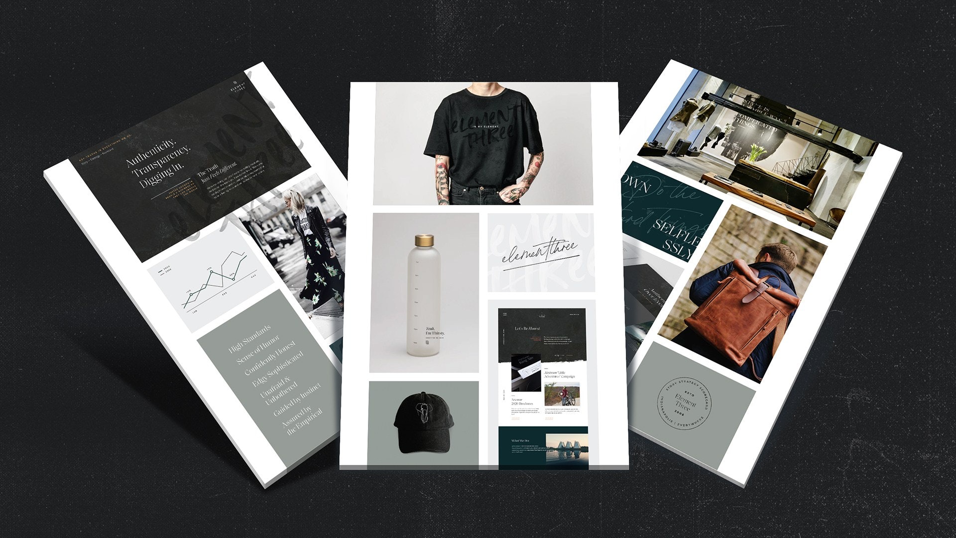
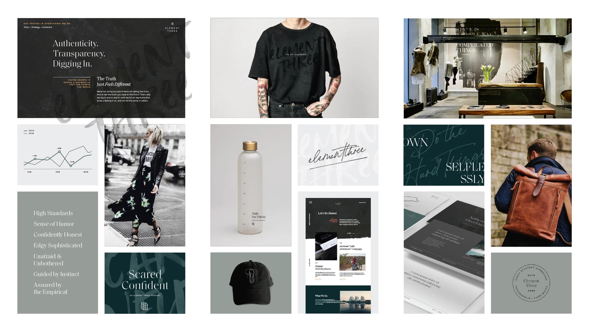
Well-defined brands can greatly benefit from a style guide, especially when it comes to developing a new website or creating concepts for a campaign that has the goal of standing out from what viewers and customers are used to seeing. If you think about some of the biggest brands, they can show up a bit differently depending on the season, what’s happening in the world at the time, or the specific product they are selling. You still recognize their brand because they stay true to their overall brand guidelines, but they change up a few key things to make the message stand out. A style guide is essential to consistency in cases like these.
A style guide should always follow the brand guidelines, however, it can push various elements of the brand for the purposes of the project and can define specific instances that weren’t addressed in the brand guide. In the following paragraphs, I will walk you through several different examples of style guides and will also provide a practical checklist of style guide must-haves.
When to create a style guide
As I mentioned before, style guides can be created at the onset of many different types of projects. One of the most common uses of a style guide is in web design, but there are many areas that can benefit from clearly communicated goals and visuals. A few others include marketing campaigns, company presentations, and any larger design piece like an annual report or publication.
Websites

Website style guides can be complex and all-encompassing — like the example above by Ramotion — if you are developing a fully custom site. If you go with a modular web-builder, it can be a simple set of rules and you can specify several custom elements like the buttons, image usage, or a few modules. A few other examples where this comes into play are:
- Text hierarchy (H1 headlines, H2 headlines, etc)
- Infographics that aren’t used in your other marketing materials
- Module background colors and treatments
You’ll want to be specific about the things that matter to you and your team. Chances are that your brand guidelines didn’t get into the nitty-gritty of your website styling, so there may be a decent amount of defining to do. Here is a helpful step-by-step guide written by Elementor for web-specific styling to help you get started.
Marketing Campaigns
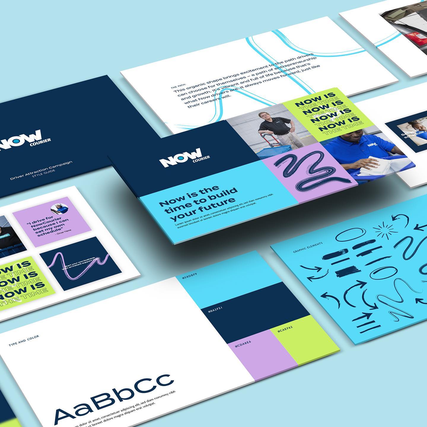
This style guide for Now Courier, designed by our very own Theresa Goodall, is a great example of a campaign-specific instruction manual. It includes the wordmark and a page dedicated to colors and typography. As individual campaigns are an opportunity to expand your visual brand, there is also a page including the addition of hand-drawn elements that can be used in various ways throughout. Finally, there are specific examples of how everything plays together in social posts.
Slide Decks and Presentations
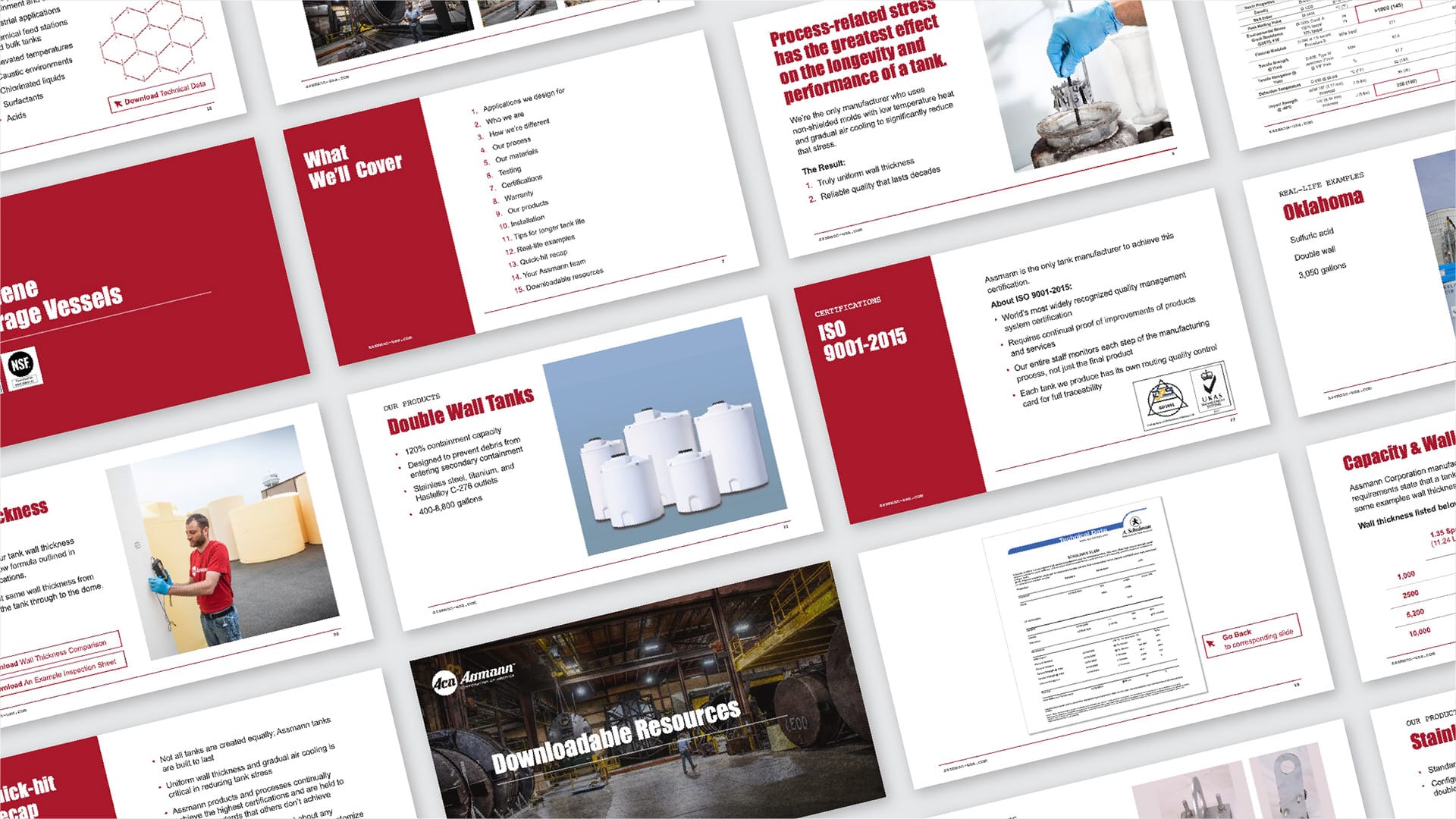
Creating a style guide for slide decks can be as simple as creating a custom theme in google slides or Powerpoint that follows your brand guidelines and includes several unique ways of displaying various types of information. The key here is setting the rest of your colleagues up for success–especially those who are not members of the creative team. This presentation style guide should be easy to duplicate and simple to adjust metrics/visuals. This can drastically improve brand awareness and consistency throughout your entire organization.
What to Include In a Style Guide
Most style guides will follow a similar format to brand guidelines, but should be specific to the end deliverable rather than general brand direction.
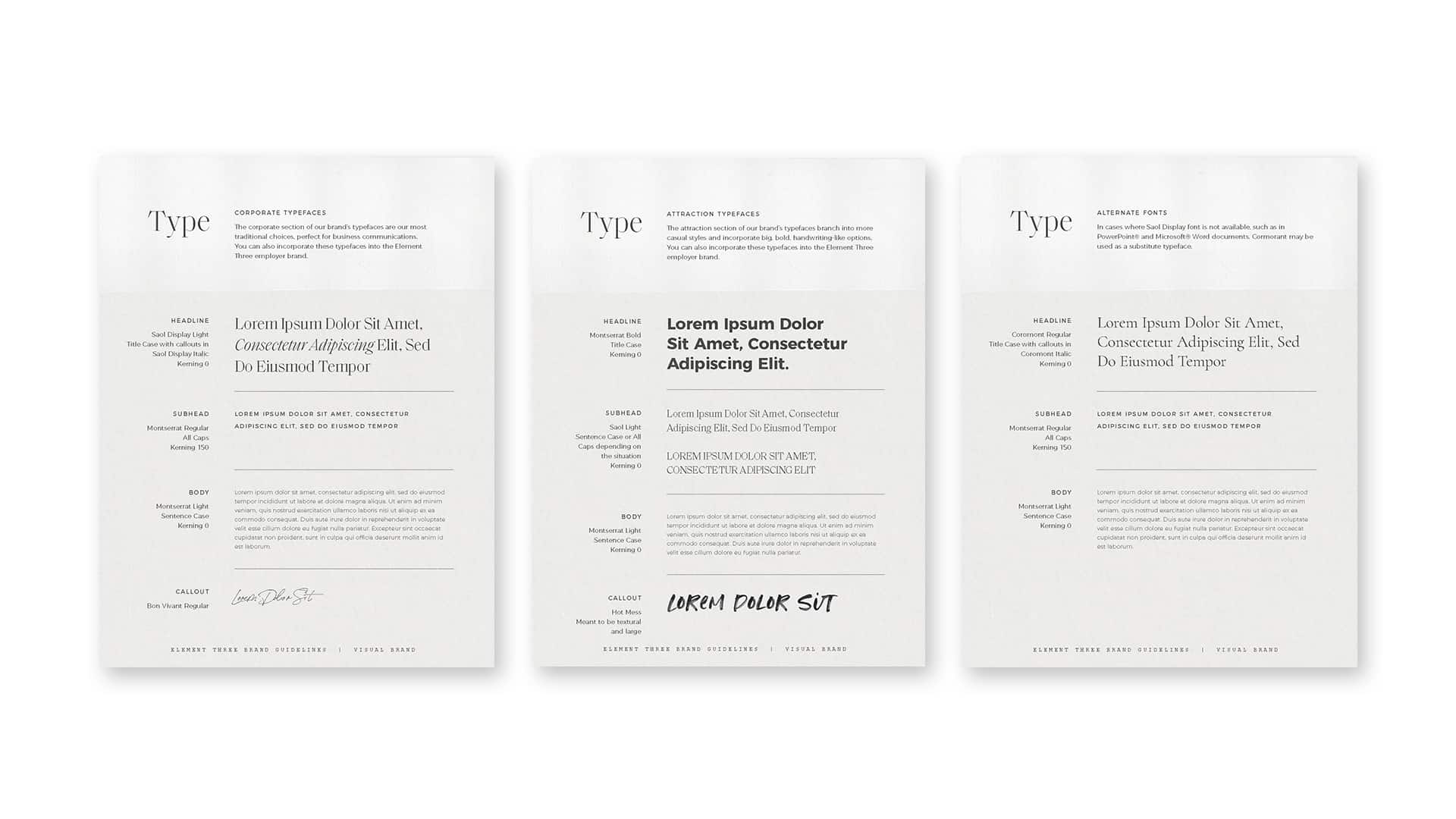
- As with any good instruction manual, clear, practical rules must be included. In the case of a style guide, typography rules should be clearly spelled out. These fonts can and should be pulled from a brand guide (if you have one) to create consistency. There are a few cases where a style guide might introduce a new font. This should be a decision that is made with intention and not just for the sake of “changing it up.” The more guidance that you can provide in the typography section the better. Include text weight, letter and line spacing, and preferred font size when applicable. All of these instructions will greatly improve accuracy and consistency.
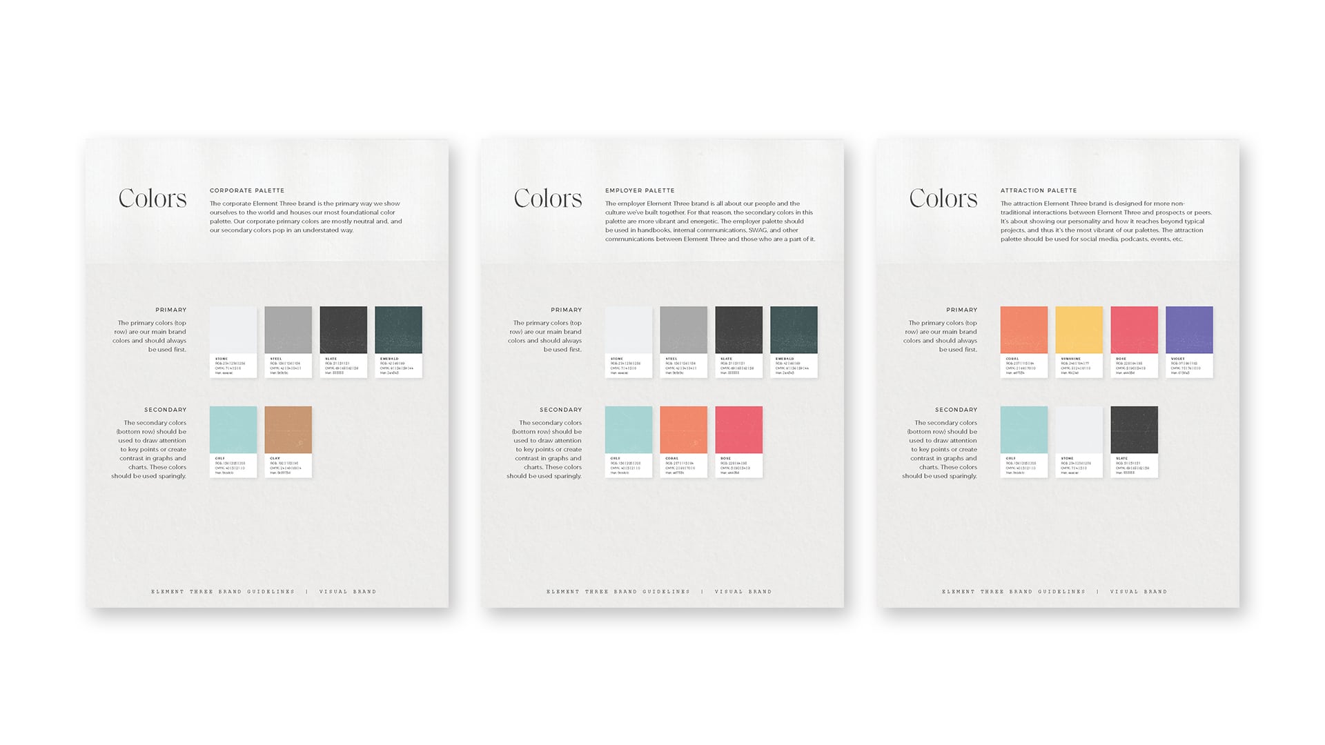
- Colors are also essential to a style guide. In almost all cases, this will be a limited color palette pulled directly from your brand guide. Be clear here if there are specific colors that should dominate and if others should take a back seat.
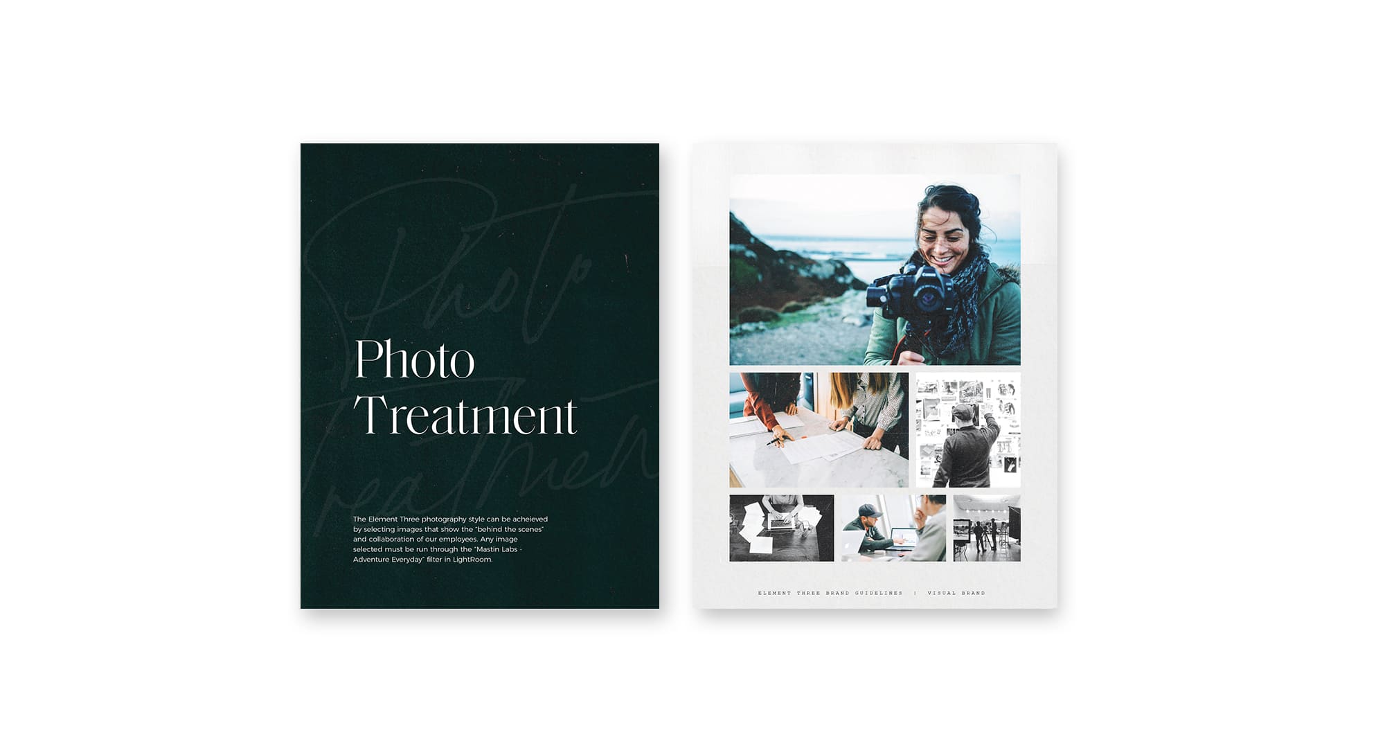
- Your brand guidelines might have been somewhat generic when it came to photography. In a style guide, you will want to be much more prescriptive. Call it out if there is a specific type of imagery that helps to clarify the message or if you want all images to include a gradient overlay. Even better, if there is already a folder of images gathered that you would like to utilize, include the link on this page of the guide.
- If there was a series of social posts created earlier in the year that you’d like to inform the upcoming work, include images in a look-and-feel section. This portion of the style guide can also look like a mood board where you include screenshots of other creative work that you want to serve as inspiration. In the case of a mood board, be sure to call out the specific items that you’d like to replicate, whether visual elements or the emotion that the work evoked in you.
Enabling Internal Delegation and Outside Resourcing
The clarity and structure around your brand created with a style guide pay dividends in many ways. As the makeup of your team grows and evolves, these guides will enable new team members to jump in and expedite their onboarding process to your brand — allowing them to create value early and ensure your brand image doesn’t slip.
If your marketing efforts require the support of an outside team — be it for web development, marketing strategy, or individual campaign work — you can share your style guide(s) as a way to continue this brand consistency once those touching it aren’t only within your walls.
You Get What You Put In
Just like any good process, it only works if you complete every step along the way. To have a consistent brand or project, you have to start with a guide. Without a guide to clarifying the strategy and defining the approach, detours will be taken along the way and the destination won’t be what you had hoped or planned for. Take the extra time and put together a style guide. You and your team will be very thankful you did.


