When you hear the term “visual branding” you likely think about logos, fonts, and perhaps a few well- thought- out colors. But, in truth, so much of visual branding that helps deliver your product or service’s message lives in other, less obvious areas.
There’s a lot more to your visual branding than you might think. Read on to discover a few key areas to keep in mind when it comes to visual branding and your product or service.
Using the Right Imagery
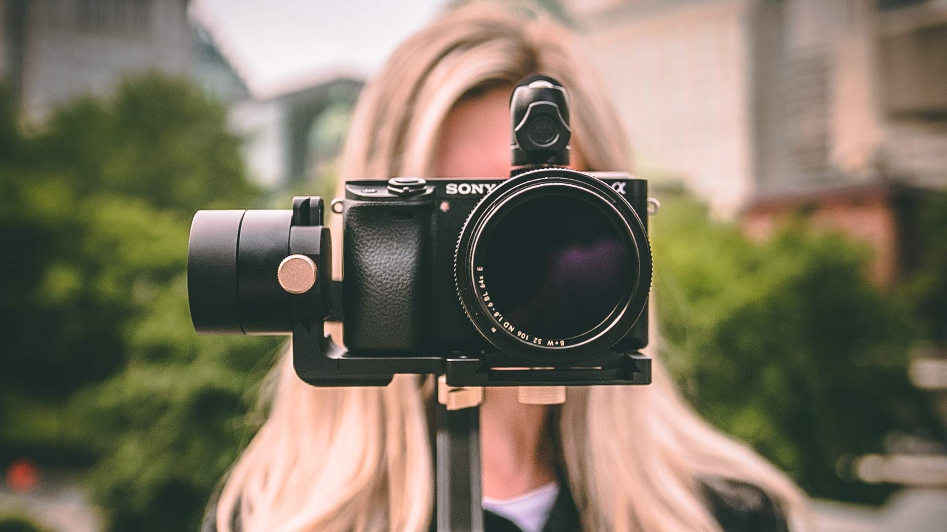
Video
Have you ever watched a commercial and been able to guess the brand before they show the final logo? Or maybe the opposite has happened to you, and you finished a commercial and thought, “That was a Pepsi commercial?!” The point is, the videos your brand produces should not merely align with your brand, but elevate it.
Brands are making the most of video as its popularity grows. Just look at Dollar Shave Club’s cleverly branded video. In just 48 hours, around 12,000 people signed up for the service, and many, many more viewers turned into brand advocates for the delivery service razor brand. And although they made it look easy, to be successful every element of your video – including the content of the video, tone, editing style, and types of camera shots – must work together to complement your overall brand message.
One company that consistently delivers is Nike. Take a minute to watch a few of their commercials.
The ideas of challenge, hard work, hope, and ultimately victory resonate through the way Nike visually tells each story.
First, they use real people and a documentary-style visual approach with no formal narration in either. It feels like we’re watching a film, not a commercial. This style, in turn, makes the characters feel accessible and real. We root for them. And because we invest in these characters, we want to see them win.
These choices are not random – Nike has a way of making us understand the importance and wonder of sport. And they wrap us into the journey, all in a one-minute commercial.
Product Photography
Photography is another aspect of visual branding that often gets overlooked. Does your brand use lifestyle photography or studio shots? What does this choice convey to your customers? Is your photography conservative, aspirational, abstract, or simple?
Again, it’s easiest to grasp the impact of photographic style and its impact on brand by looking at a few examples. Check out the product imagery for Duluth Trading Co. versus Bonobos. Think about their target audiences and what message each brand is trying to convey. Duluth is a no-nonsense, down-to-earth, and somewhat quirky brand that calls their “money-back guarantee” a “no bull guarantee.” Their product photography is casual with photos of men crouched down, showcasing their shirts covering the “plumber’s butt.”
One the flip side, you have Bonobos. If you go to their product page, you’ll find much sleeker design, simple imagery, and larger photos that reinforce their high-quality product.
You won’t find either brand’s colors, logo, or fonts in either product shot, but you can still recognize the differing brands through the way they photograph their products.
Consistency and User Experience
As more and more people experience products and services on screens, an online experience consistent with your brand is critical. Whether a customer or lead is interacting with an app, receiving an email, or browsing a website, how they digest your content has a huge impact on how they view the brand.
When it comes to UX, you have to design with intentionality and create a consistent experience. How a user moves through the website should not change once they reach a product page or checkout process. Although you might be tempted to think about design over usability, doing so can be frustrating for the user. Find a good balance between the two, provide useful content to your customers, and you’ll be happy with the results.
Physical Space
Walk into Ikea and then head on over to Restoration Hardware. Feels a little different, right? Whether you’re designing a branded space for employees or customers, it’s important to make the space match the tone of your product, service, or company.
For retailers we’re talking about visual merchandising. Every choice you make in regards to employee uniform, lighting, colors, textures, material, packaging, and presentation sends signals to your customers. And whether you love them or hate them, there’s no denying that Apple’s physical locations represent everything the brand stands for – innovation and clean design.
Additionally, your office should visually represent your brand. Open spaces invite collaboration. Bold, bright colors say something completely different than neutral, subdued hues. Should the furniture be uniform or eclectic? Your employees likely spend a lot of time in the office – don’t neglect it.
Swag
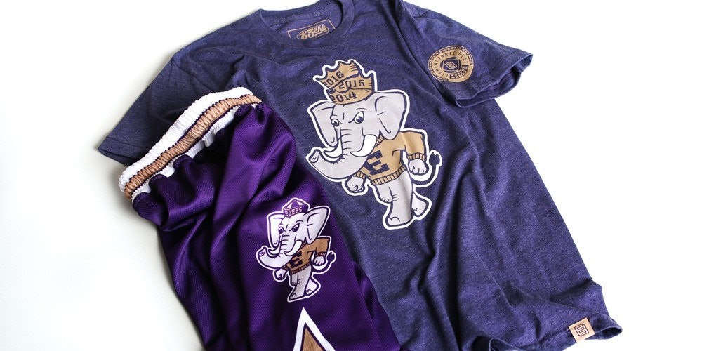
Odds are your company has some swag lying around. Whether that’s promotional pens, stress balls, or company t-shirts, one glance around and you’ll probably (hopefully) find one piece of branded material. If you don’t, we strongly encourage you to add it to your strategy. (We also might be a little biased – we love swag.)

Companies often think about swag or promotional materials as an added bonus. In reality, swag is a great opportunity to further your visual brand identity both internally and externally. Investing in promotional material for your employees will help them buy into your brand (and get the brand in front of their friends’ eyes), while sending additional products to clients or handing them out at trade shows can introduce new business to your brand.
Visual Branding is More Than Logos, Colors, and Fonts.
In today’s competitive market you can’t afford to slap your logo on something and call it a day. Think about what makes the medium you’re working with unique, and make visual choices to match the message you’re trying to convey. And if all of this talk about brand is making your head hurt, feel free to reach out to us for help.


