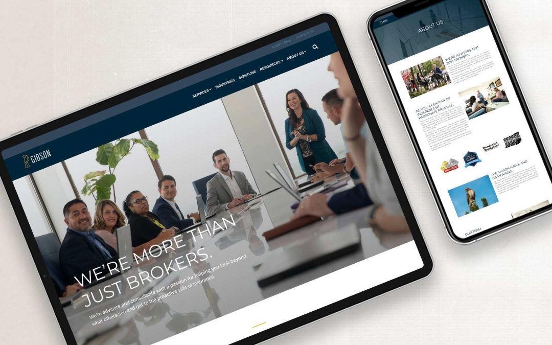
Gibson helps clients find their edge. We helped them turn that strategy on themselves and their own brand.
As a client of theirs, we experienced Gibson Insurance as who they are today: forward-thinking, broad-sighted, and abundance-minded. But the Gibson brand itself was stuck a few evolutions back and didn’t reflect who they’ve grown to become. They needed a refresh that could stand on its own among top brokers in the country, while creating new focus and energy for employees.
WHAT WE DID
Brand Discovery
Core Values
Visual Identity + Logo Redesign
Website Design + Development
I was super impressed along the way with Element Three and how they listened and asked so many questions. They pulled all that together and truly captured what we mean when we talk about creating a great experience.”

Tim Leman
CEO, Gibson
STORY
What’s an “edge” and how do you capitalize on it?
Since 1933, Gibson Insurance has grown from small office to a regional and now national brokerage. And as with any growth, Gibson’s strategy and scope changed along the way. When we met, their answers to our questions about who they are, why they do what they do, and how they’re different from other brokerages—or even the idea of insurance brokers—immediately sparked inspiration.
From our very first meeting with Gibson they talked about what they do for their clients, how they work, and the outcomes those clients experience. After listening, observing, and gathering data we uncovered Gibson’s truth, the heart of their brand, and what makes them different—they help their clients “find their edge.” It’s in how all of your insurance, benefits, safety, and compliance strategies come together to create a company that attracts and keeps talent, covers any and all bases and risks, and helps you grow as a company.
That’s an edge. And Gibson helps every single one of their clients find and embrace theirs.
STRATEGY
Finding Gibson’s edge and helping them own it.
We didn’t create the Gibson brand; we revealed it. Through our own research and time spent getting to know the Gibson team and their approach, we were able to see in them what may have been hard for them to see in themselves. Because when you’re inside the jar, you can’t read the label on the outside.
So how could we help Gibson hone in on their own “edge”?
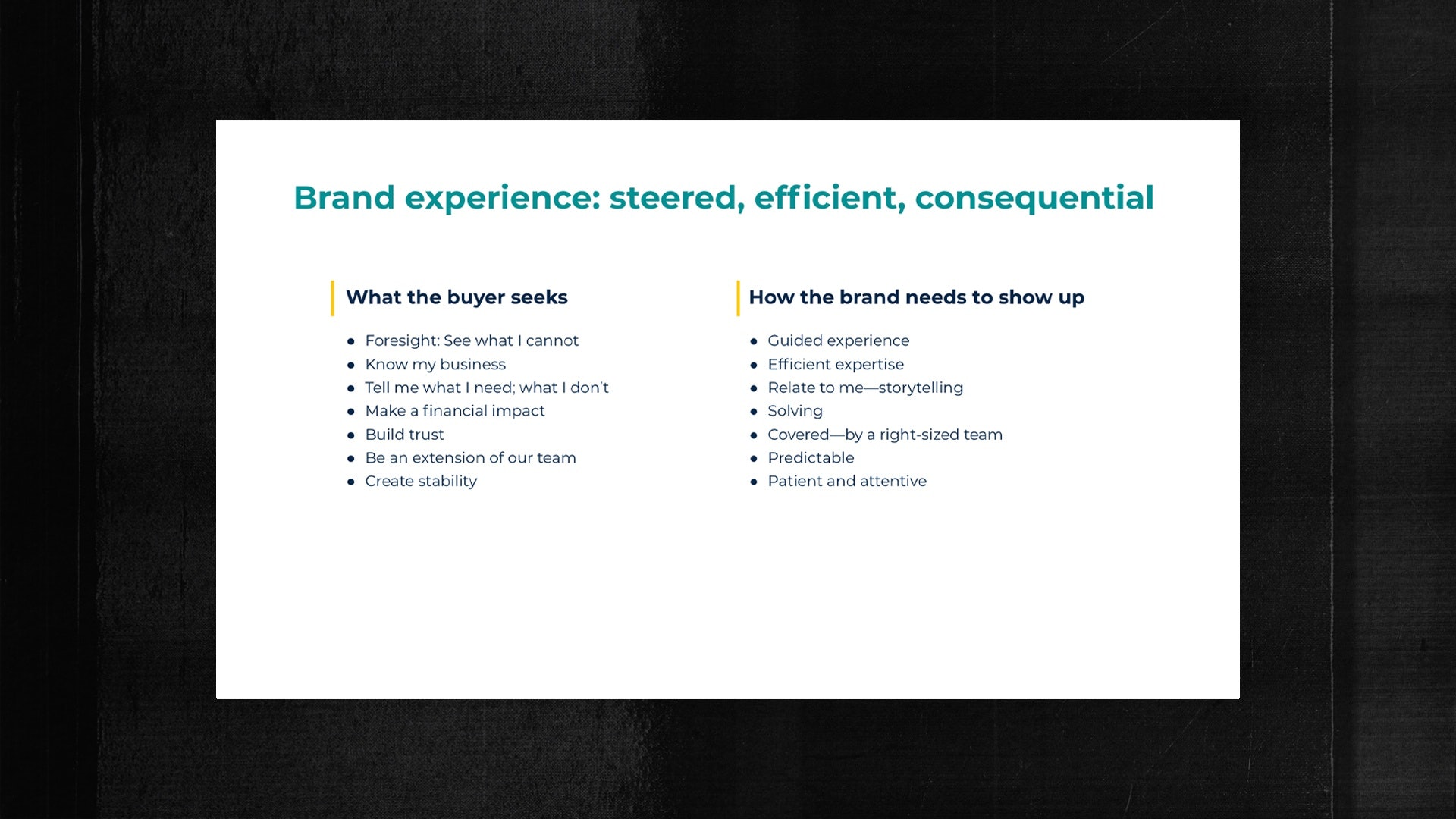
The process took time —from start to finish, nearly a year. Research, brand development, and creative expression took place before the pandemic. The final four months, in which we developed the website, created Sightline, and launched the brand, were all executed in a Zoom environment. Throughout the process, we asked questions and then more questions, and then more, until we felt like we knew the Gibson team as well as we did our own. We started with the more obvious and rational aspects— that those outside the company can see, like attributes and benefits of Gibson — and then worked our way into the more emotional aspects — core values and purpose.
Brand attributes and values help build a strong foundation
APPLYING THE GOLDEN CIRCLE CONCEPT TO GIBSON
If you’ve seen Simon Sinek’s wildly popular TED Talk, you know that people don’t buy what you do, they buy why you do it. It’s called the Golden Circle Model, and it’s an exercise that helps any brand focus on what they really sell to the world. Here’s Gibson’s Golden Circle.

SO WHAT DOES A HAWK HAVE TO DO WITH ANYTHING?
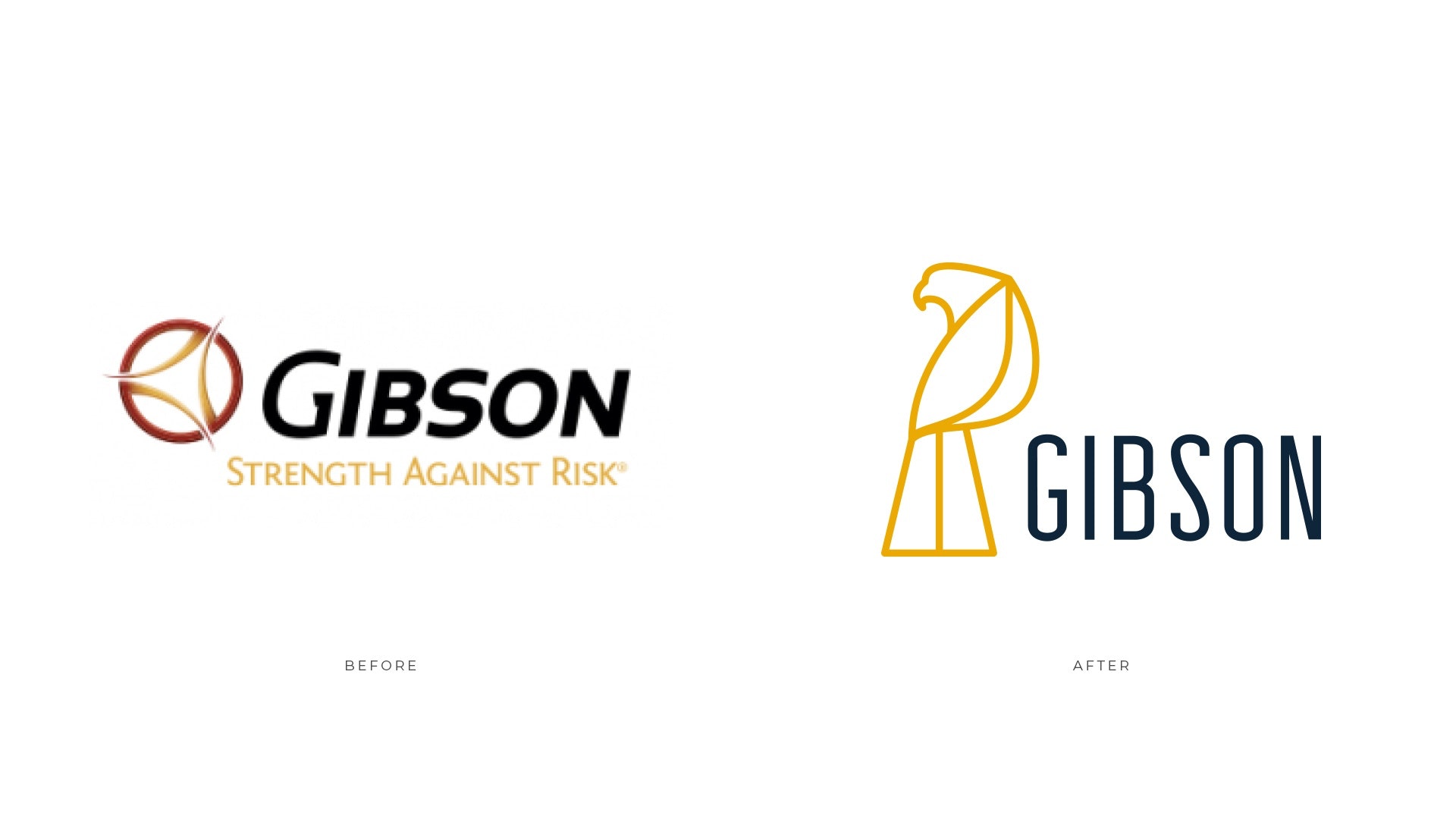
Once we had the heart of the brand defined and understood, we moved on to building its external look and feel, starting with an entirely new logo.
Gibson’s previous logo was focused on a compass, but from our research we learned that was simply too passive. A compass is a tool, but Gibson is the guide who uses it. Yes, they survey the landscape, but they also act on their observations. They’re more like a hawk: broad, wide-spread vision and precise skill to strike when and where needed.

REBRANDING GIBSON’S APPROACH: A HAWK’S-EYE VIEW
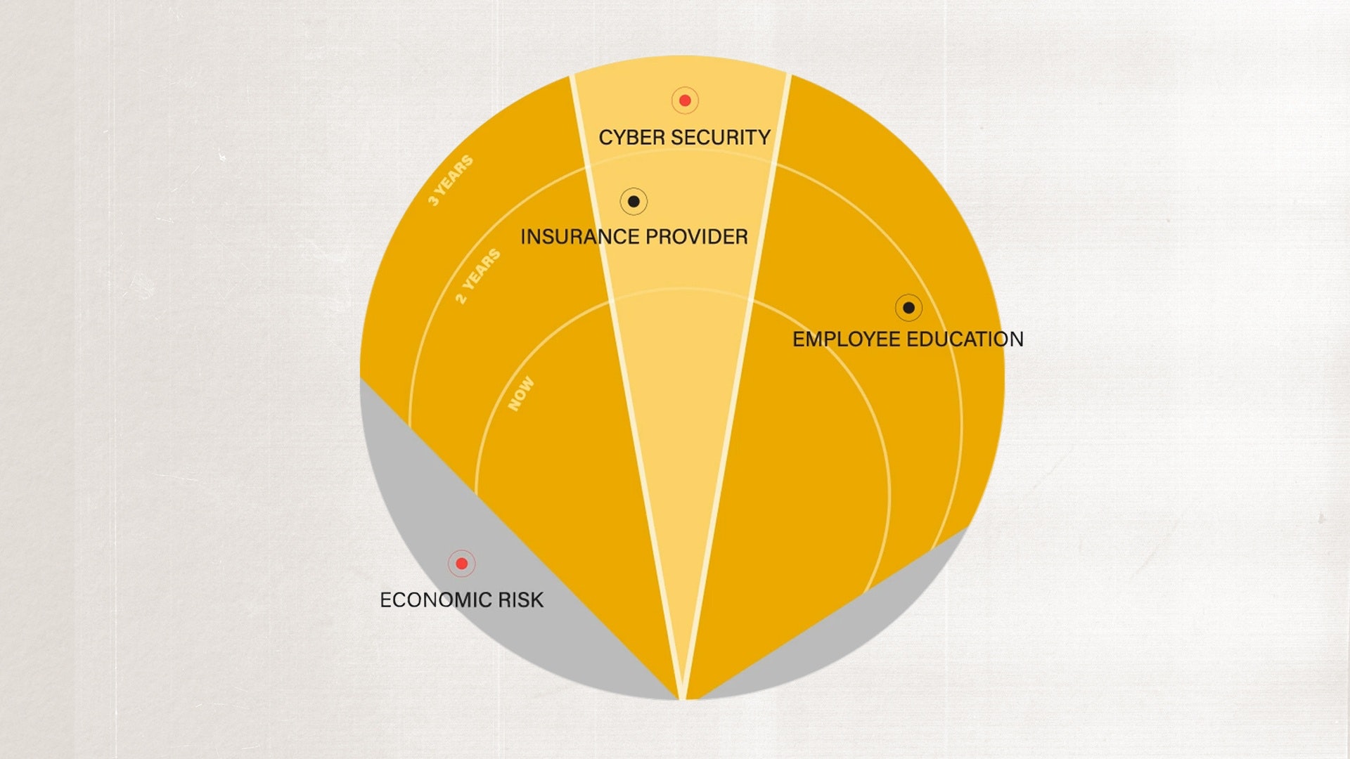
Gibson’s unique discovery-oriented approach is how they find the all-important “edge” for their clients, so it had to be a big part of the rebrand. We dug into what was working about the process and what could be better, and re-imagined what was known as GPS to
become Sightline.
Sightline is inspired by the wide-spanning vision of a hawk—nearly 360 degrees.

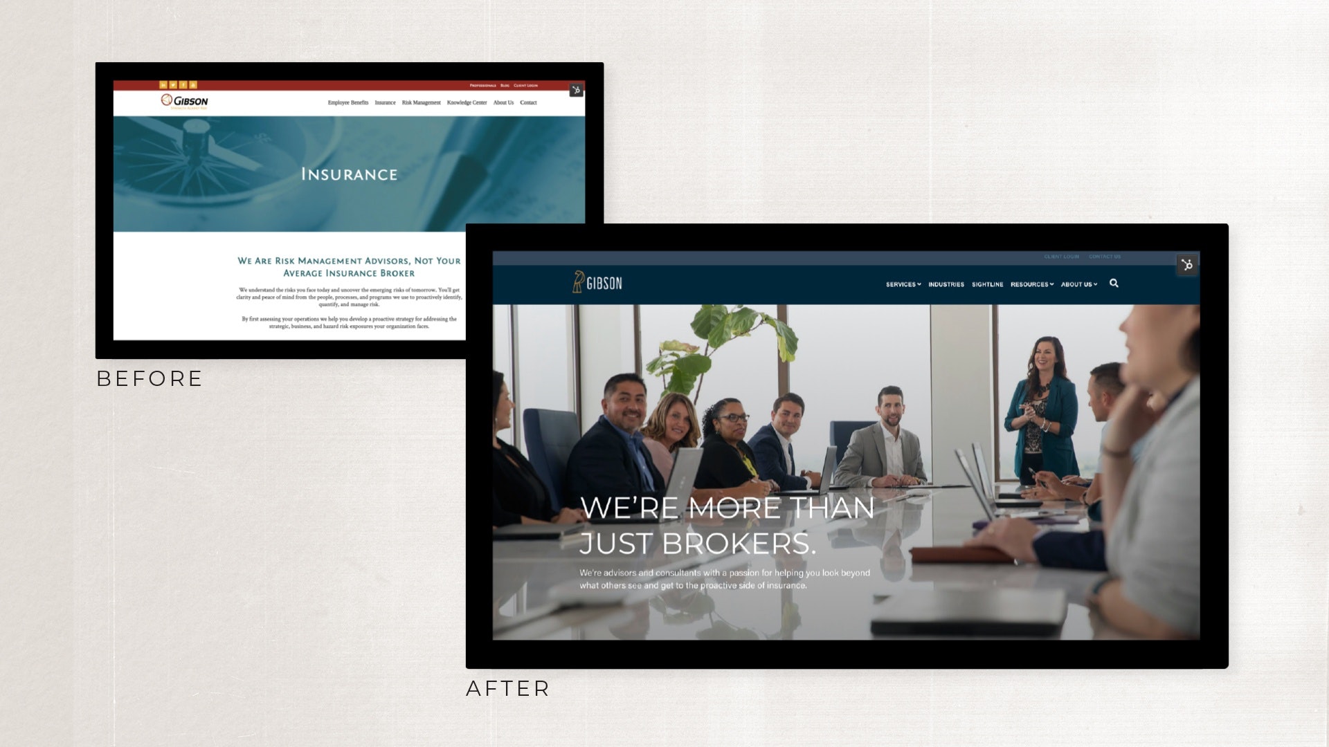
THE WEBSITE IS A PROOF POINT, AND IT HAS TO ESTABLISH THE RIGHT VIBE.
While a new website might be first on your list of wants, the Gibson rebrand proves that it’s actually one of the last steps in bringing a new brand to life. The “why” was clear, the positioning was established, the look and feel was re-invigorated, and only then was it time to put it all together on a new website.
In a business like Gibson’s, a website is one of your biggest proof points. The sales process happens largely in person (or Zoom) and through referrals, and it’s the website’s job to back up everything you conveyed in those meetings.

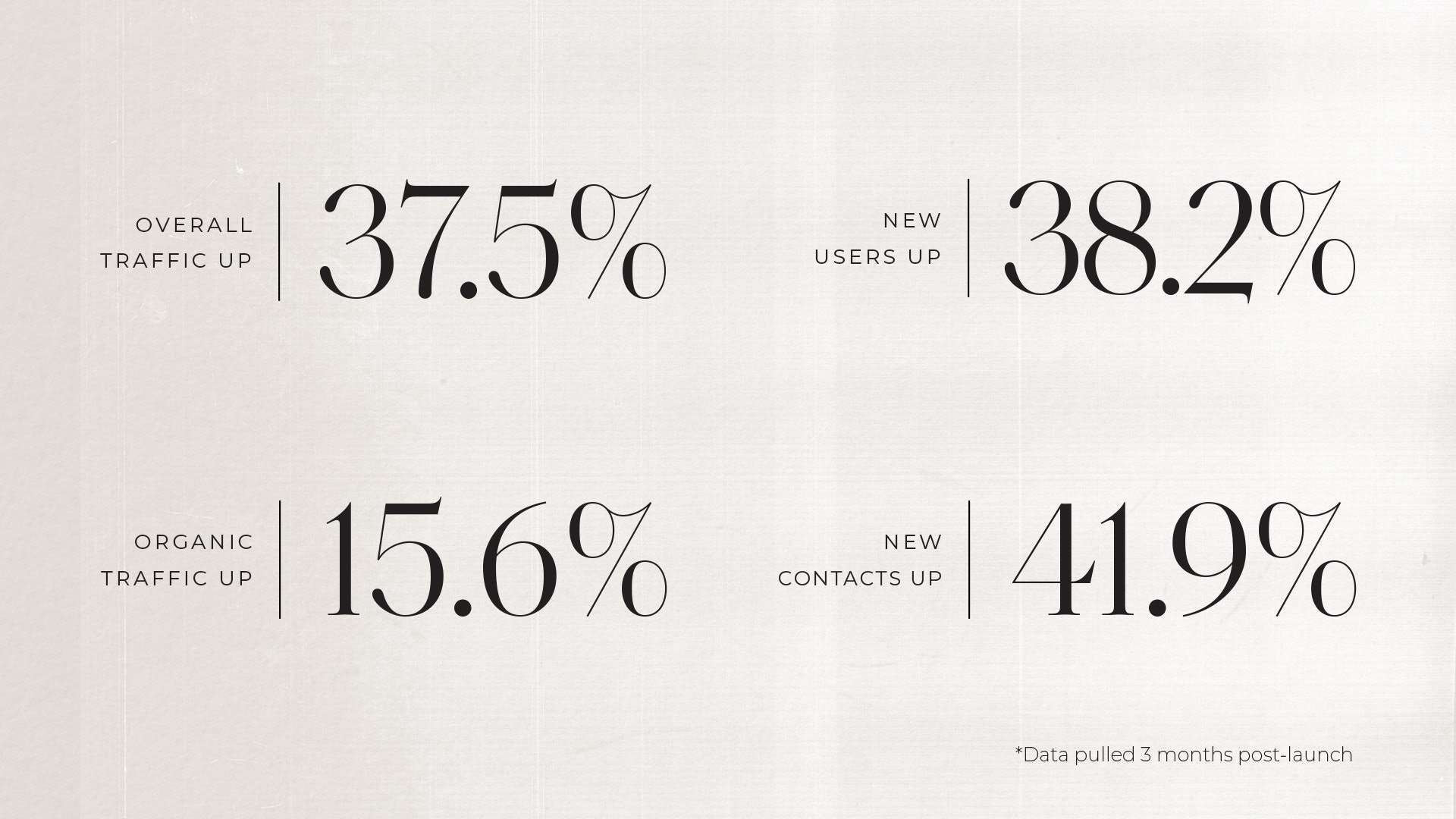
SCORECARD
The re-brand and website are launched, and here’s the early feedback.
Success in a project like this one — that dives deep into the intricacies of a brand — depends heavily on the people who work on it. And in this case, we were so fortunate to have the Gibson team. Throughout the entire project, they did what was critical: trusted the process, took an honest look at themselves, participated with enthusiasm and thoughtfulness, and had the courage to evolve their brand (both in our work together and beyond).
6 WEEKS AFTER LAUNCH:
I’ve been calling on a large group (about 5,000 enrolled) for a month. Just now the prospect called me on my cell phone and said our website impressed him, and that doesn’t happen very often. Because of that, he was willing to let us come in next week to host an executive briefing for them. For everyone involved with this rebrand, you knocked it out of the park!”

Allen Howard
Consultant, Gibson
Interested in something similar?
Ask Joe how to get started.
