
For pros immersed in the marketing and tech world, new advances in usability and connectivity will seem like obvious ways to find customers. Unfortunately for every martech champion in a company, there’s an equally stubborn luddite on the other end trying to legitimize maintaining the status quo.
Instead of talking about all the cool things we can do with a new website (which are many), let’s just talk about some serious issues your current site may have that should indicate it’s time to make a change. Watch out folks, things are about to get dirty.
Thus, welcome to Element Three’s digital home inspection, where we walk through the nooks and crannies of your website to determine its integrity and overall value. This is our comprehensive inspection process for analyzing websites and determining if it’s time to upgrade.
We’re going to walk through all the terrible issues that could be happening on your website right now. Seeing any one of these issues, let alone several, should be an immediate indicator that you need an overhaul. Some are technical, some are customer specific, but they’re all pretty critical.
Just like a normal home buyer’s inspection, honesty here is the best policy. Ignoring an issue won’t help your home gain more value, all it does is hurt your chances of making money at the end of the day. Note that this inspection applies equally well to those of you already in the process of redesigning your website. Better to check these off before the new site is live to avoid any unnecessary and expensive trips back to the drawing board.
Round 1: The Exterior (i.e., The Visual)
Non-mobile Friendly or Responsive
This is a big one, folks. Mobile-first should be on everyone’s minds after the previous year’s numbers. For those unaware, mobile usage grew an alarming 395% from 2010 to 2014. Furthermore, we’ve reached a critical point in usage where mobile internet activity is actually outpacing desktop usage. And of course it is, in all likelihood you have a computer in your pocket right now or are even reading this on a small screen.
Having a mobile-responsive site allows any user anywhere to find you, connect with your brand in their preferred method, and potentially convert in some way. There’s nothing worse than finding a site like this on your cell phone while trying to get something done.
Statistically speaking, maybe that’s why conversion rates are actually higher on desktops than most mobile devices. By prioritizing the desktop experience, companies are being left behind. Numbers show a 8.5% global conversion rate on desktop and tablets, but that drops off to about 4.9% on mobile phones. This tells us that users are engaging with content that’s properly created for the right devices, and those that are neglected bounce more, losing potential revenue.
Now the good news is you don’t need multiple versions of the same website. You do, however, need to have the right underlying functionality on site to resize appropriately. Why miss out by letting your old clunker site piss off mobile visitors?
TL:DR – Dated siding? Demerit.
Color Scheme
This is always a surprising one to us. Some outdated websites will work with odd color schemes seemingly in an attempt to be en vogue. From our point of view, if your brand is blue, then why go with neon green or assaulting yellow? However, it goes way deeper than that.
Color and brand association have roots in the psychology of humans. Most people’s perceptions of color relate back to their upbringing, but 90% of quick purchasing decisions made about products can be based entirely on a brand’s color and its connection to the company. From a branding perspective, one solid color should embody your brand, and a small set of secondary colors should be used to support it in the right places. From a conversion standpoint, differing color schemes placed in the right area will actually draw the eye, so for a point of conversion having a contrasting colored button will prove to be effective.
A color scheme issue though relates to just a general smattering of color across the entire site. Use of photo-realistic design skins, conflicting color formats, darker site themes and color over usability is always a bad idea. Use color to your benefit when it comes to identifying your brand, but do it with purpose and always in moderation.
TL:DR – Bad paint job? Demerit.
Imagery: Clipart, Stock Images, etc.
Images and videos resonate more with online visitors. Research found that people’s interest in content rose by 80% just by including colored visuals. Simply having the word “video” in email communications boosts open rates by 19%. Curious why? Think about it: written content floods the internet, but as a general user, videos encompass the same information in a more digestible format. Same with imagery.
Most important of all, though, is conveying a genuine nature about your company through your efforts online. Prior to the internet age, marketing was one-sided, and consumers just had to take what businesses offered. Now with reviews and freedom of opinion out there, thinking customer-first and offering a true look of your products and organization is critical.
An interesting study about Organizational Counterfeiting found that consumers experience fight or flight emotions when it comes to their favorite brands. In the case of finding counterfeit products comparable to the real ones, consumers will either champion the true brand, or run to the cheaper alternative. The breaking point was perceived value for various customer bases, and without a genuine regard for a product, customers bailed. While this was studied through the lens of clothing brands, the principle applies across all companies: genuine display of a company’s products, services, benefits and pricing will attract customers, whereas the discovery of falsehood and little value results in a backlash.

*Huzzah what a diverse team we have! You’re buying this right?
From a visual perspective, this means ditching your stock photos. The prevalence of social photo sites and selfies means the web is flooded with real imagery, and staged stock photos automatically initiate a drop of visitor trust. A picture is worth a thousand words, and if you’re using stock images of businessmen shaking hands, arms folded looking at the camera, all one thousand of those words are “terrible.” People value genuine people, and the same goes with brands. Take care with your imagery so it represents you in the right way.
TL:DR – Poor landscape maintenance? Demerit.
Clutter
Main man Barry Schwartz, author of the book, “Paradox of Choice,” covers this very cool study about purchasing decisions in grocery stores. He describes an experiment where researchers set up two displays with jam for customers to buy. One display had 6 or so varieties of jam, and the other had 24. While the larger display brought more of a crowd, the purchase decision was far different. Thirty percent of people bought a jar of jam from the smaller display, compared to 3% from the larger display.
The issue of clutter can occur in various places but it can definitely be an issue on a website. Take online retail for example, the kings of clutter. Giants like Amazon sell everything under the sun, which is a daunting task for any user. Nearly a third of retail site users go straight to site search – more than any other part of the site. That’s because it gets right to the point, and keeps things simple.
People need simplicity, and too much going on on a website will actually deter people from engaging. You need a clear path for any visitor to go from Introduction to Conclusion and not have too many pitfalls along the way.
TL:DR – Roof falling apart? Demerit.
All Visuals, No Text, Tags or Meta Information
“But Grady, didn’t you say images and video were awesome?” I sure did, but you still need to do it right. Search engines can crawl and understand text, but they’re not sophisticated enough yet to understand image meaning. For that to happen, you either need overlaying text written in HTML, or meta information (i.e. Alt Text) for all your images that identifies their subjects.
Some folks out there claim that Alt Text has gone the way of the dodo, but frankly they’re just some dodo heads. Black hat SEO’s stuffed Alt Text in the past with meta keywords just to boost rankings, and in response Google’s algorithm was updated to downplay its relevance overall. However, it is still critical in identifying the image’s meaning, otherwise to a crawler it is just another black box. Placing a custom image of Toast on a site all about Artisan Toast, and properly identified as Toast, will then add to the overall score and relevancy of the page’s content.
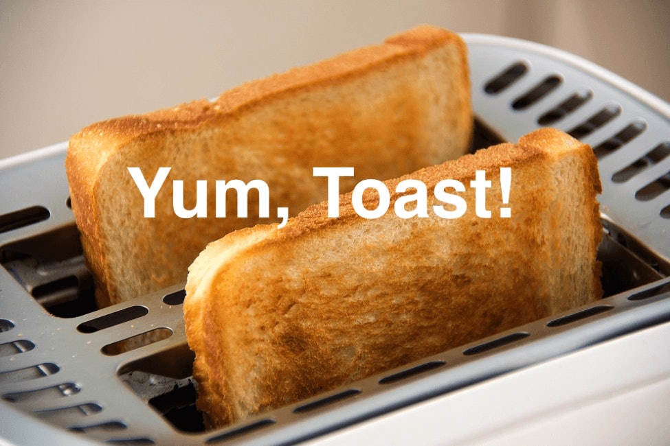
*So far as a robot is concerned, this is a picture of a bowl of cereal, because that’s how we described it in the Alt Tag. Without anything, a crawler wouldn’t know what this is a glorious picture of, even if you do.
Same sort of thing goes for videos. Meta information needs to be included to help associate the right topic with its content. To really make it optimized, you should include a custom script within the closed captioning. Not only will this help your hearing impaired visitors, but it adds a crawlable version of your video. Schema markup is the latest form of meta tagging, the implementation of which will allow you to tag any image or video, its length, topic, origin, and more.
You should always have text on site to describe your services and direct visitors to the right places. The key here is balance, folks.
TL:DR – Drafty, no insulation? Demerit.
Round 2: The Foundation (i.e., Technical Structure)
Poor CMS Platform
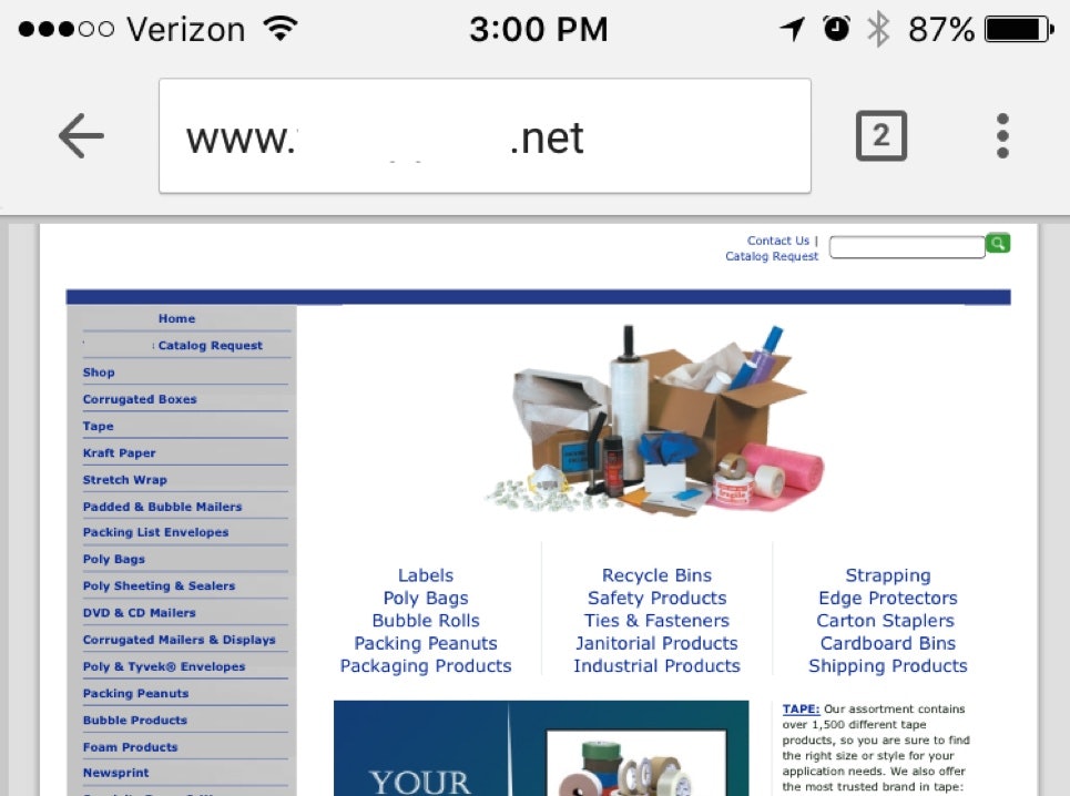
Sorry folks, but there are good Content Management Systems (CMSs) and there are bad ones. Most of what defines a “good” CMS has to do with user interface and flexibility, but some are just flat out horrible from a technical SEO perspective. It’s widely accepted that WordPress is one of the best out there. If you’re running on Accrisoft, Ektron, Joomla, Dot Net Nuke or Drupal you might have a huge anchor weighing you down.
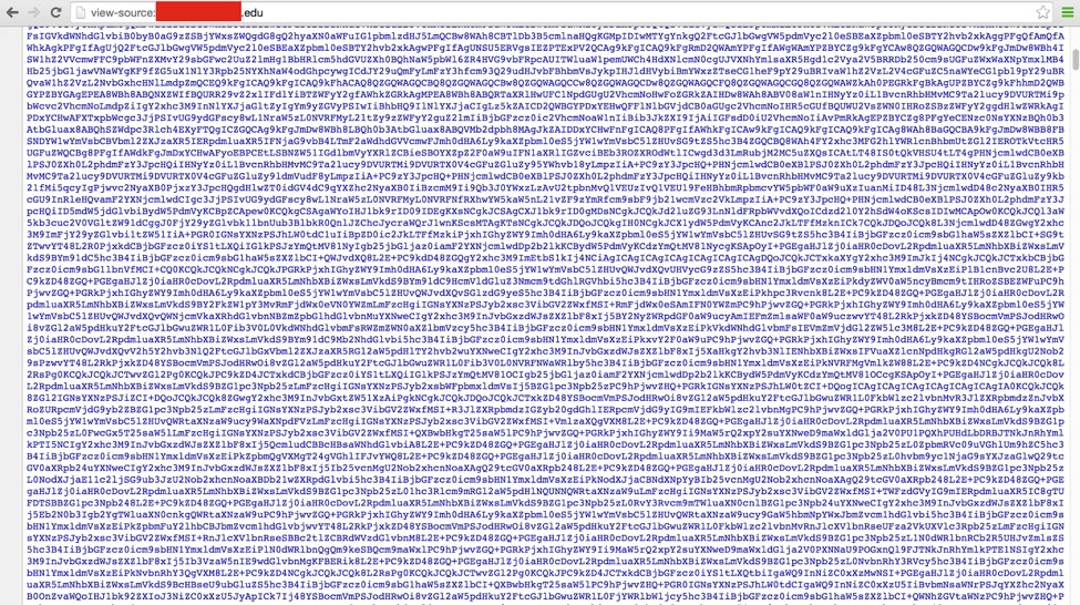
*This is (no joke) the output of a Dot Net Nuke website, into the body of every page. And I wish this was an isolated incident, but it isn’t.
A proper CMS should give you the power to seamlessly add, edit and customize each of the following:
- Web content
- Navigation
- Media files
- CSS and HTML
- Templates and design
- URL structure
Furthermore, all of those features should be able to be handled outside of the originating files, through an easy interface outside of your hosting panel. As an organization you should be master of your website and have the ability to edit anything at any time. There is absolutely no reason for putting off a change because your system is too cumbersome when better alternatives are out there.
TL:DR – Soft foundation? Demerit.
Poor URL Structure
Your URL is your site address (e.g. www.gradyrules.com/its-true/) and identifies where your site files are located for browsers to then interpret and render to visitors. A bad URL structure ultimately means a bad file structure, which can cause loading issues. For example, with improper trailing slashes in the URL, you’re telling the browser to search for a specific file rather than a directory. This will then cause it to ping your servers multiple times to find the right files, slowing down load times and damaging your user experience.
But, bad URLs also can hurt your SEO by including a garbled mess of random slashes and letters, and dividing up your authority over multiple sub-domains. The use of a subdirectory (“gradyrules.com/subdirectory/”) ensures all associated keywords are directing towards your main website, driving all traffic to one unified location. A subdomain (“subdomain.gradyrules.com”) is technically a brand new website, with an isolated and separate set of files. URLs should be clean and simple, identifying the tree structure of your site and the content within.
TL:DR – Bad pipes? Demerit.
Poor Page Speed
The time it takes for your site to load (or your pages to render) has a huge impact on both usability and SEO rankings. We live in a “get it now” culture, and anything that takes too long will result in visitors going elsewhere. Google knows this, and has made page speed times a critical element for website health and SEO rankings. Any number of things could be slowing your site down, and it’ll take expert help to speed it up properly.
To check your page speed, go to this URL and input your website for analysis. If you’re in the red, then that’s a Red Flag.
TL:DR – No ventilation? Demerit.
HTTP Over HTTPS
This one isn’t huge yet, but I have a feeling it will be in a year or so. HTTP is the basic protocol for data communication across the web, but it is also flawed and easy for hackers to take advantage of. On the flip side there’s HTTPS, which is a more secure version of data transfer. Not only is it safer and harder for malware attacks, it’s faster too. This is exactly why Google is pushing for everyone to make the switch, and ridiculing websites until they get it done. Bottom line, you need to switch to SSL soon.
How do you do that? Well first you need to get an SSL certificate through your hosting provider, which allows your site to be delivered via HTTPS. Then you’ll need to perform 301 redirects for all of your current URLs from the “http://” version to “https://”. All site links and navigation items will need to be changed as well. If you have a smaller website this shouldn’t be a tough endeavor, but for more expansive sites, this can be troublesome., It’s a very tedious process, but one that’s well worth it.
TL:DR – Security woes? Demerit.
Use of Flash
Chances are if you use Adobe Flash on your site it’s for some large creative display. A designer might think it’s the freshest thing this side of the 90s, but you should never be using Flash on any website ever (sorry Adobe). It’s buggy and doesn’t render across most browsers, it’s incredibly slow and will drag your site down with it, it’s not optimizable for search, it doesn’t work on most mobile devices, and it has to be installed to be interpreted.
*You may be asking, “Why was Flash even a thing in the first place?” So are we.
All that means only a tiny percentage of the entire world can see any kind of rendered Flash. And search engines hate it too; it’s totally inept for optimization purposes, and now Google is shunning it in other ad based formats. So robots and humans alike are denouncing Flash because it flat out doesn’t work. Why not just make something everyone can see, people and search engines alike?
TL:DR – Thin walls? Demerit.
Round 3: The Interior (i.e., Content)
Outdated Content
The first thing bots and visitors are going to do when they get to your site is read your published content. If it is incorrect, outdated, full of grammatical or formatting errors, or if anything’s out of line, it could result in a visitor bounce or your site not being properly indexed. This touches on our point earlier of genuine marketing tactics. If you’re not going to be serious about promoting yourself and quality, why would a customer be serious about purchasing from you?
Data shows that you have 8 seconds to impact a visitor to your site before the majority leave. That translates to a stellar headline to pull them in, and tell them why they should stay and read on.
Furthermore, this content needs to be placed correctly on the site so that it can be properly read and understood. Has your content been sitting for several years? Is it published in an iframe, image or flash device? Find any errors anywhere? Does it talk about old products, services, or employees? If so, that’s a red flag.
TL:DR – Leopard print wallpaper? Demerit.
Multiple H1’s
This is a core SEO issue and I actually see it a lot. It is another problem thanks to those dastardly Black Hat SEOs. Google used to place a huge value on H1 header content, but then Black Hats started to make everything on site an H1. They ruined it for everyone, to the point that if you have more than one H1 on a page or your site, you might be viewed by as a hacker trying to manipulate your SEO rankings, and you can get de-indexed. Double check your H tags, folks.
TL:DR – Uneven flooring? Demerit.
Duplicate / Syndicated Content
It is incredibly easy to steal things online, whether it’s images, ideas and especially content. Repurposing content is as easy as copying and pasting sometimes, but even online you need to cite your sources. If you’re found with duplicate content, or even in some cases syndicated content, it can be viewed in the wrong way, particularly by search engines like Google.
Enough duplicate content means that you’re trying to appear to be a real and unique online entity when you’re not, which can get you blacklisted. Syndicated content is supposedly acceptable, but if done correctly according to Google, the content would be “noindexed,” providing no SEO value for it. And while there are legitimate exceptions to what Google considers invalid duplicate content, if you’re trying to influence search results, that almost certainly isn’t one of them. Bottom line: if you want more organic traffic and ranked keywords, you need unique content sitewide.
TL:DR – Congested floorplan? Demerit.
Ineffective Positioning
This point is a bit more interpretative. Your site content needs to be written so that it effectively describes who you are, but also what you are selling, and why your visitors should be interested. This can be boiled down to a solid value proposition, addressing all the reasons why a customer might object, establishing trust and value, and creating incentive to convert.
Simply stating you have “The New DST4700” means nothing to readers. What is it? What does it do? Why is it better than the last version? Why should I care? And probably most important of all, why should I convert with you all? I have the entire world at my fingertips right now, why shouldn’t I just look this up on another site?
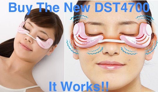
*I mean everyone is buying them, I just didn’t want to look stupid
Conversion XL puts it expertly: “A value proposition is the primary reason a prospect should buy from you. Customers not only want to know, ‘What’s in it for me?’, but ‘Why buy from you?’” This means you need to differentiate yourself from competitors while clearly explaining your strengths. Use content to your advantage, and cover every question and concern a visitor might have about your service on your site. This will allow you to pre-qualify prospects, simplify your sales process, and weed out anyone who’s not a good fit.
TL:DR – Old appliances? Demerit.
So, is your house still standing, or is it sinking into the ground?
The only reason marketing online moves fast is because your customers are likely moving faster. If you’ve run through this list and you found several demerits, then you are only damaging your company’s prospects by trying to sweep your failing website under the rug and ignoring the problem. Get moving in the right direction by creating a competent website your customers will love.